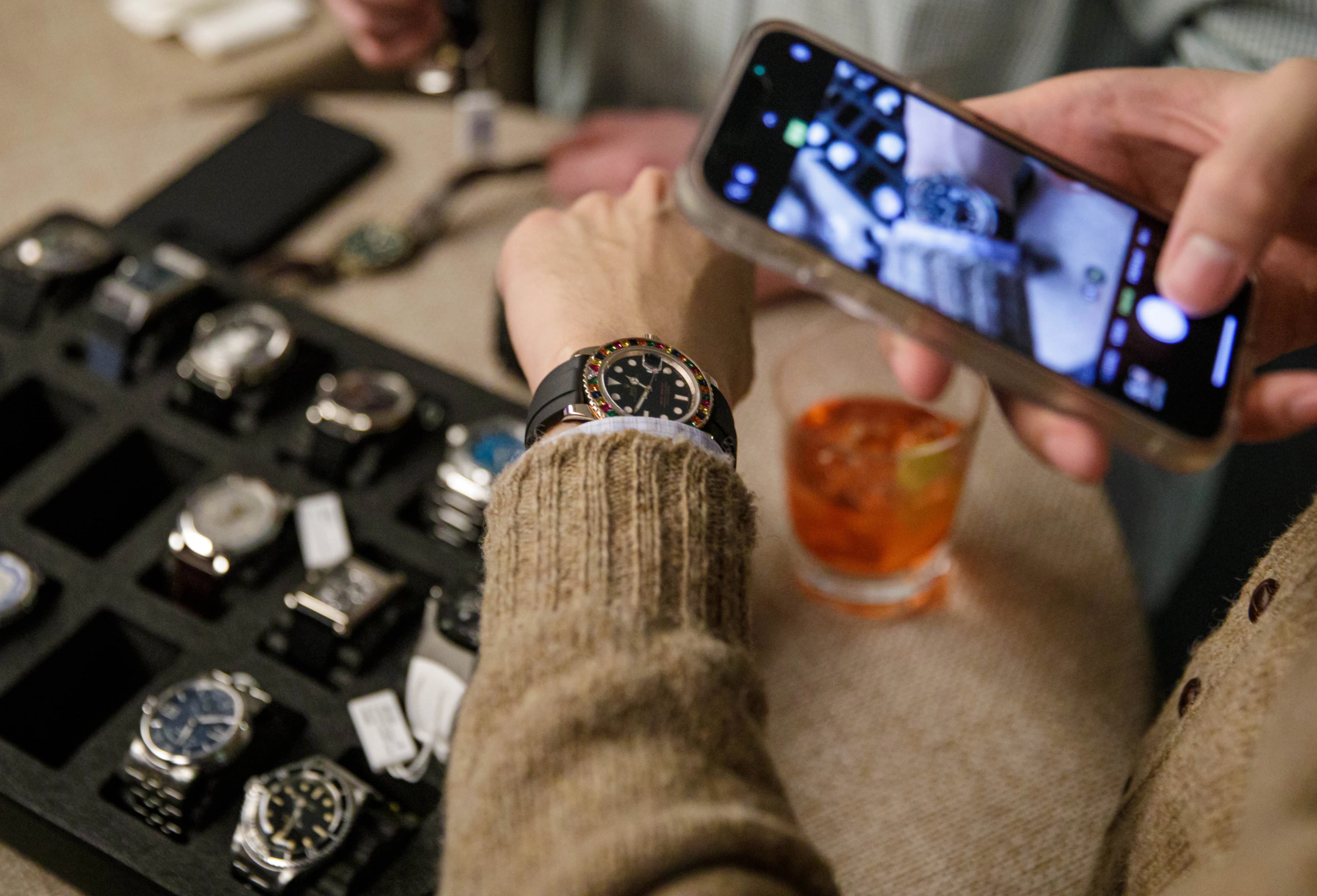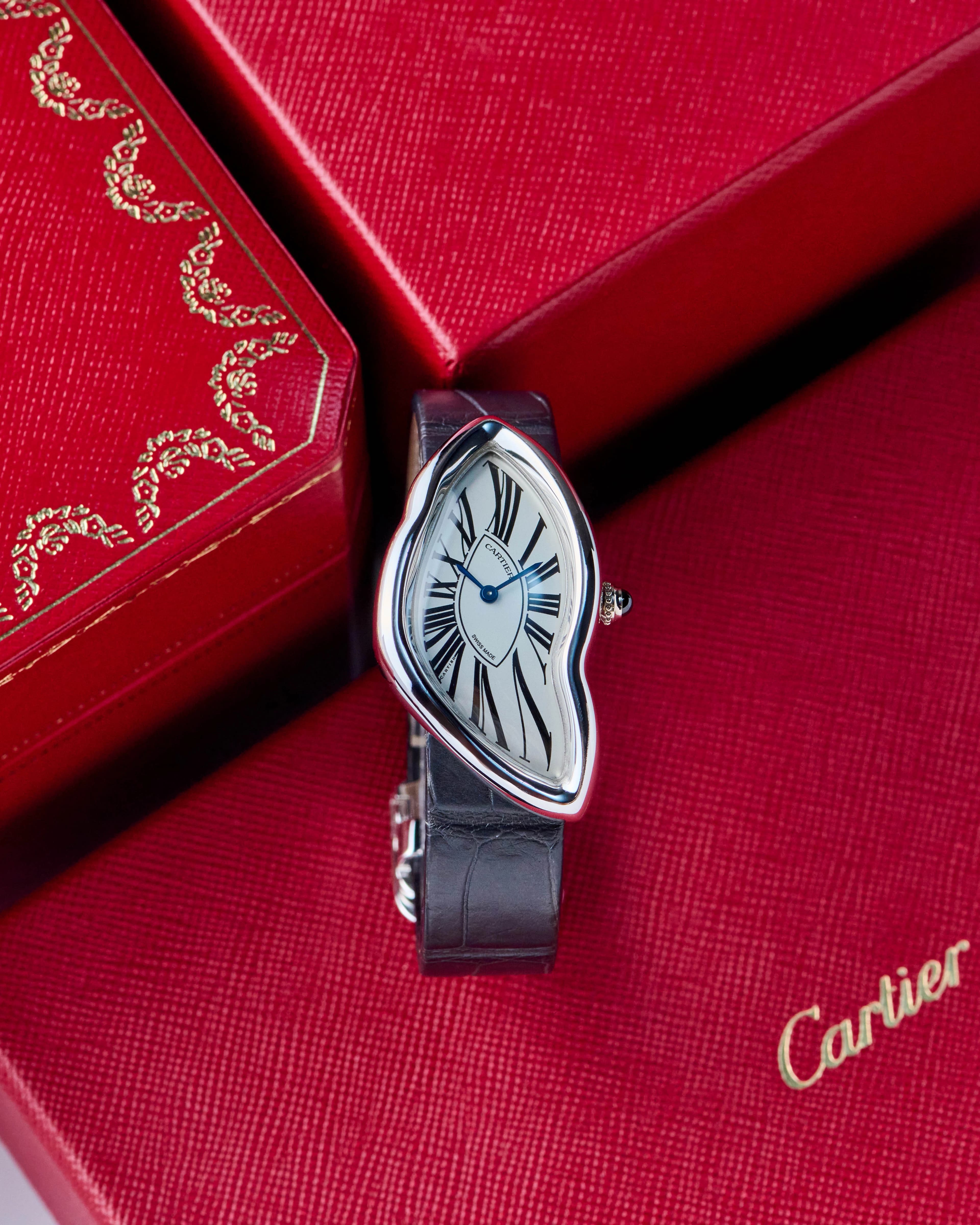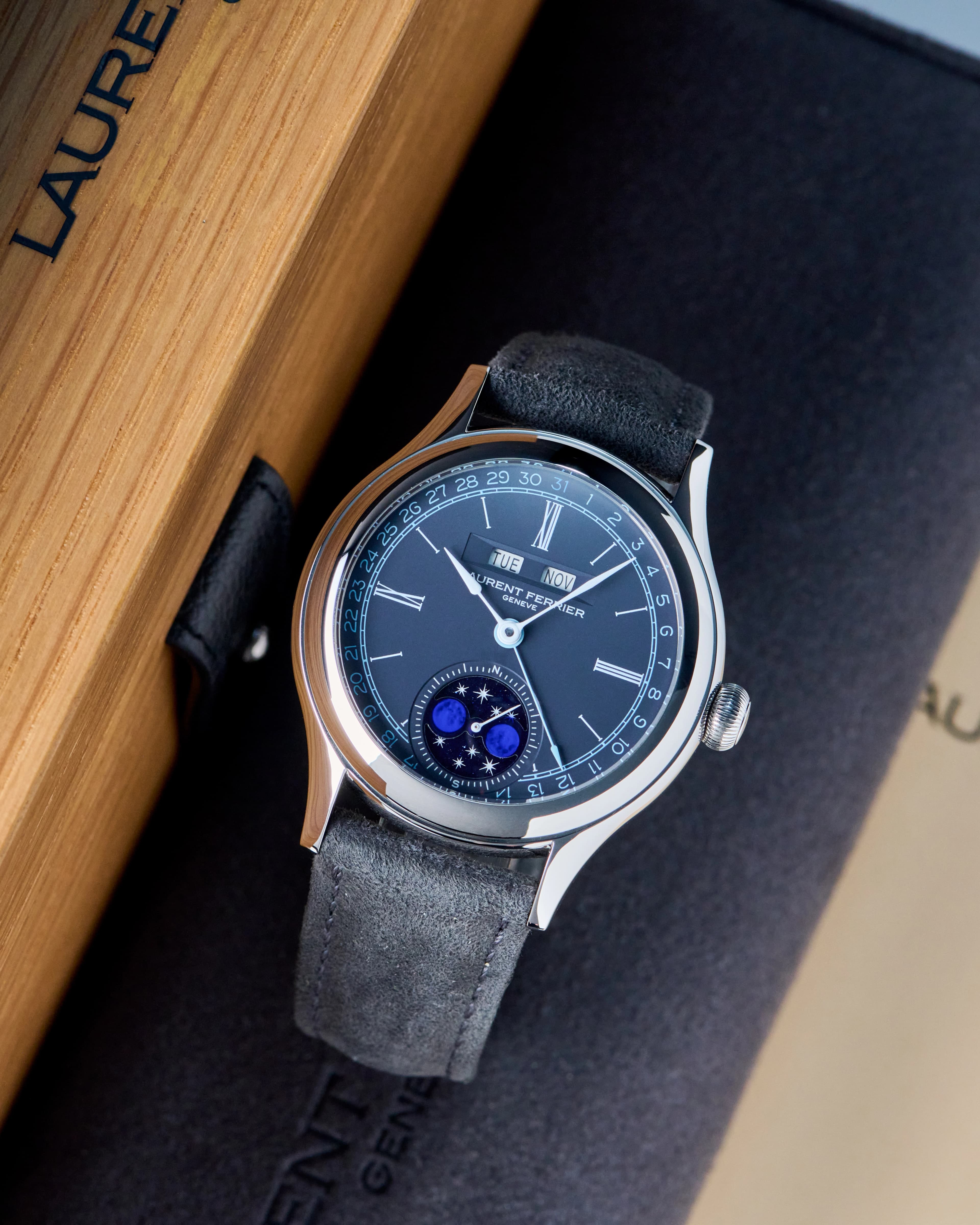
There are few things in watch collecting as quietly divisive as the date window. It doesn’t shout. It doesn’t pretend to be complicated. It just… sits there. A tiny square cut into an otherwise carefully composed dial, daring anyone to ask whether it really needed to be invited.
The date complication is the horological equivalent of adding a calendar reminder to a handwritten love letter. Technically useful, but emotionally questionable.
And yet the date persists. Not because it must, but because watchmakers keep finding clever, beautiful, and occasionally audacious ways to justify it.
How the Date Got Here (And Why It Refuses to Leave)
The date complication didn’t emerge from artistic ambition; it came from necessity. Early wristwatches were utilitarian instruments, born from military, industrial, and professional needs. As watches became everyday objects in the early 20th century, displaying the date made sense. People relied on mechanical watches the way we now rely on phones: as primary references, not accessories.
But as mechanical watches slowly transitioned from tools to expressions of taste, something curious happened. The date stopped being necessary, yet refused to disappear. Instead, it became a design problem that designers and engineers have been wrestling with ever since.
Some chose brute force. Others opted for subtlety. A few decided to reimagine the entire dial just to make the date behave.
Those are the watches worth talking about.
When the Date Earns Its Seat at the Table
Roger Smith Series Six
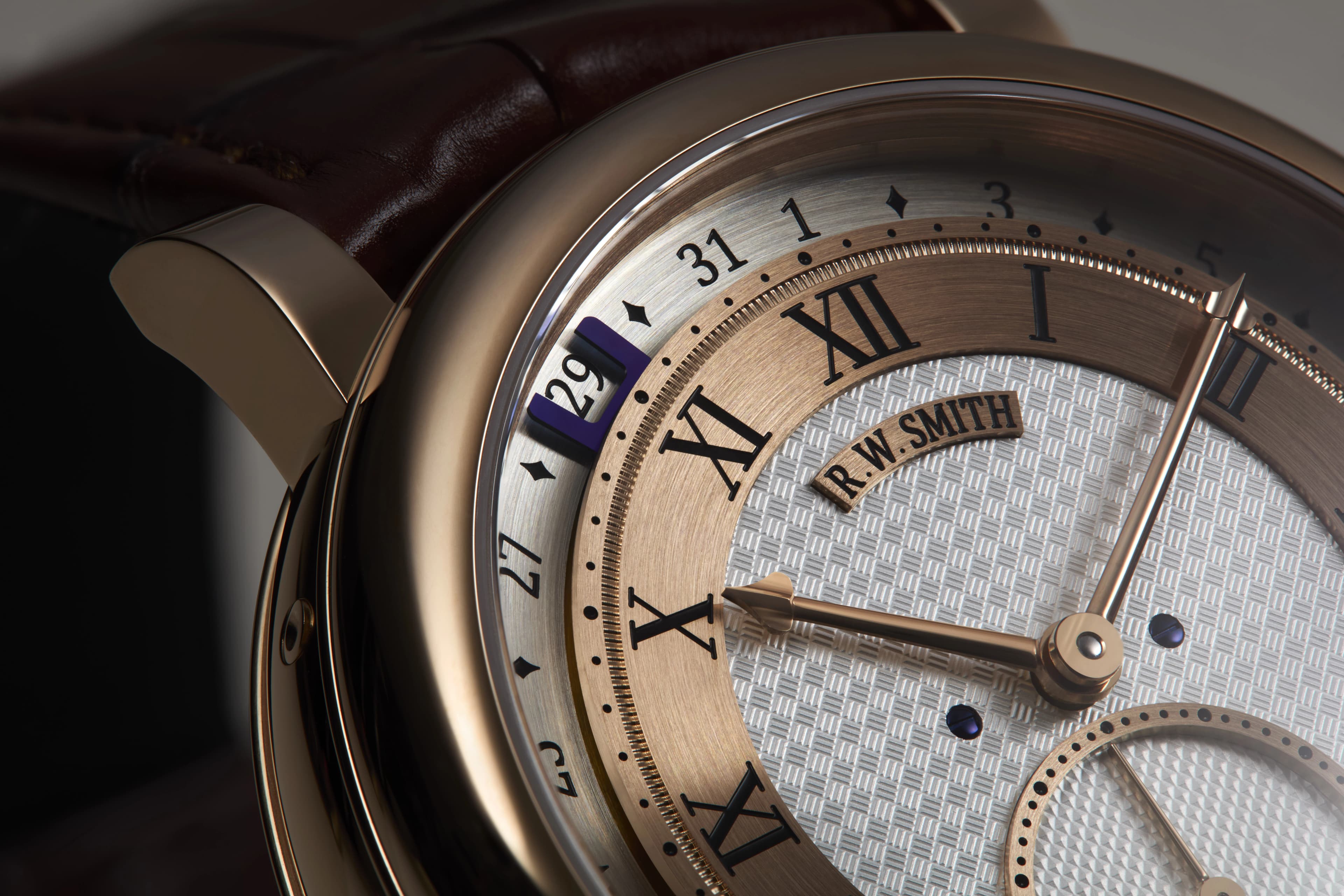
If the date is going to exist, it should matter. The Roger Smith Series Six doesn’t tuck the date into a corner. It does the opposite. Smith’s traveling date display places the complication at the heart of the dial’s architecture, allowing it to move with intention rather than interrupting the composition. This is not a concession to practicality, but rather a declaration that the date deserves to be designed, not tolerated.
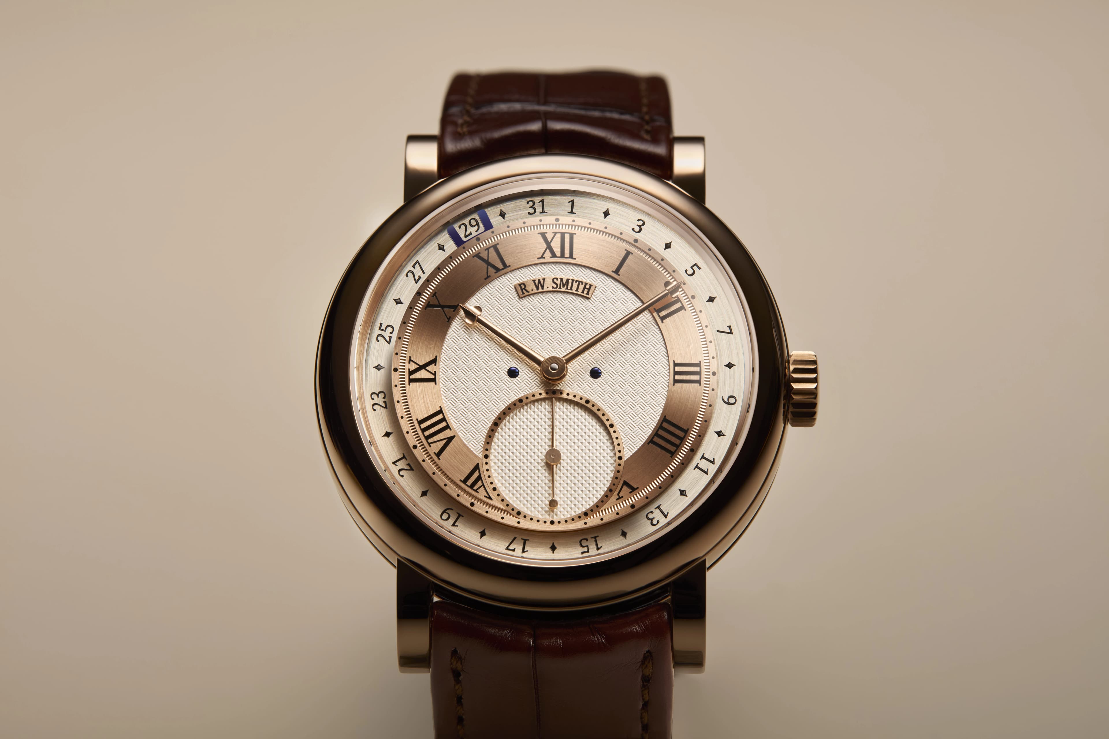
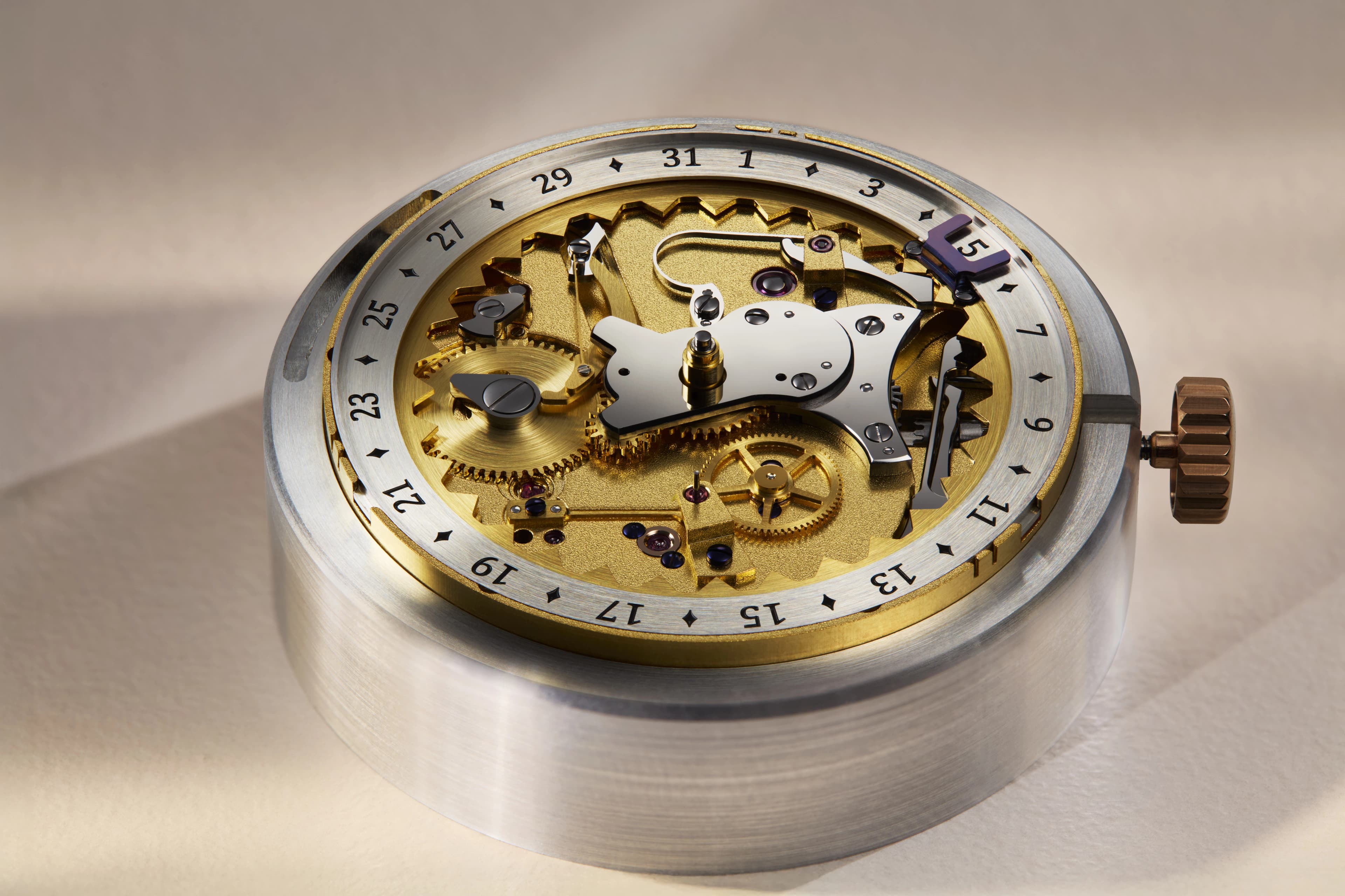
“Traditional date windows often feel like an afterthought, frequently obscured by the hands. My traveling date concept, first introduced in 2014, was a direct response to this – a quest for uninterrupted clarity,” explains legendary watchmaker Roger W. Smith. “I wanted the date aperture to be a real presence on the face, not just displayed but part of the theatre and deliberate architecture of the watch. The traveling date concept appears to have gained traction within the watchmaking world in the years since, and for Series Six I have pushed this further, engineering an entirely new calibre developed to focus purely on this complication.”
That philosophy is visible immediately. The date doesn’t fight the hands. It doesn’t disappear behind them. It advances with purpose, becoming a moment rather than a reminder. Everything about the Series Six feels considered, from the layout to the pacing of the complication itself, because the movement was conceived around the date, not forced to accommodate it.
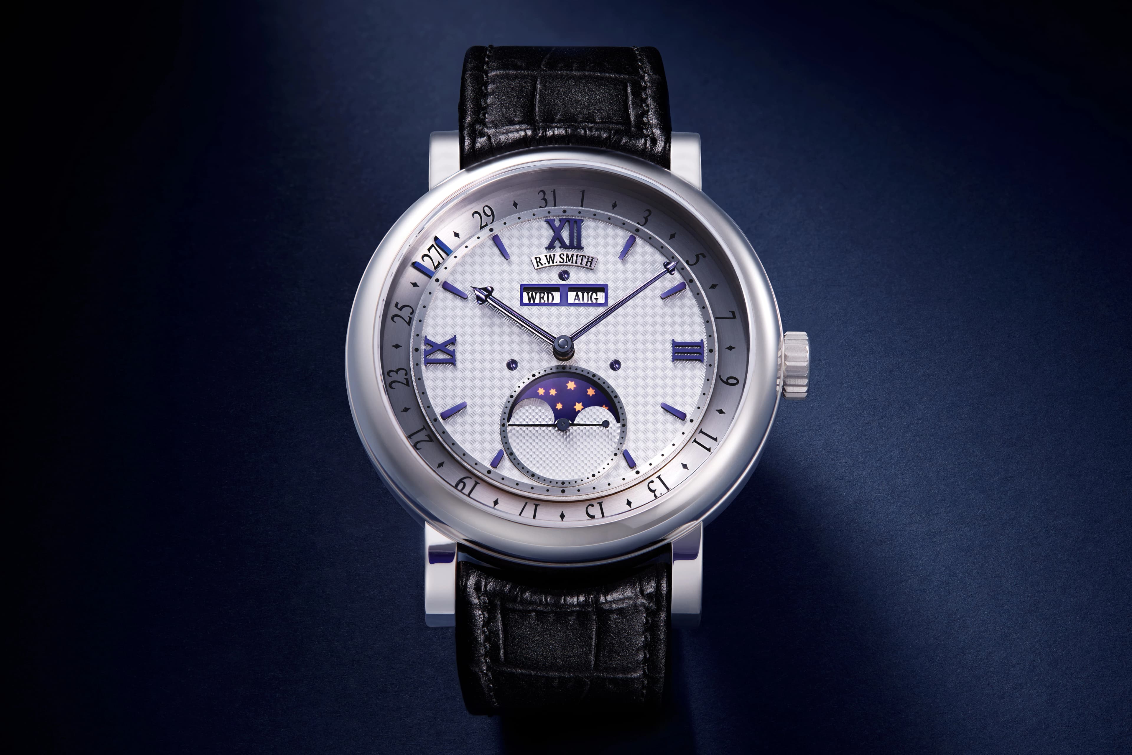
Roger W. Smith Series 4, an earlier iteration of the traveling date concept
This is what date display innovation looks like when executed by one of the most accomplished living watchmakers. The date isn’t apologizing for being there. It’s performing.
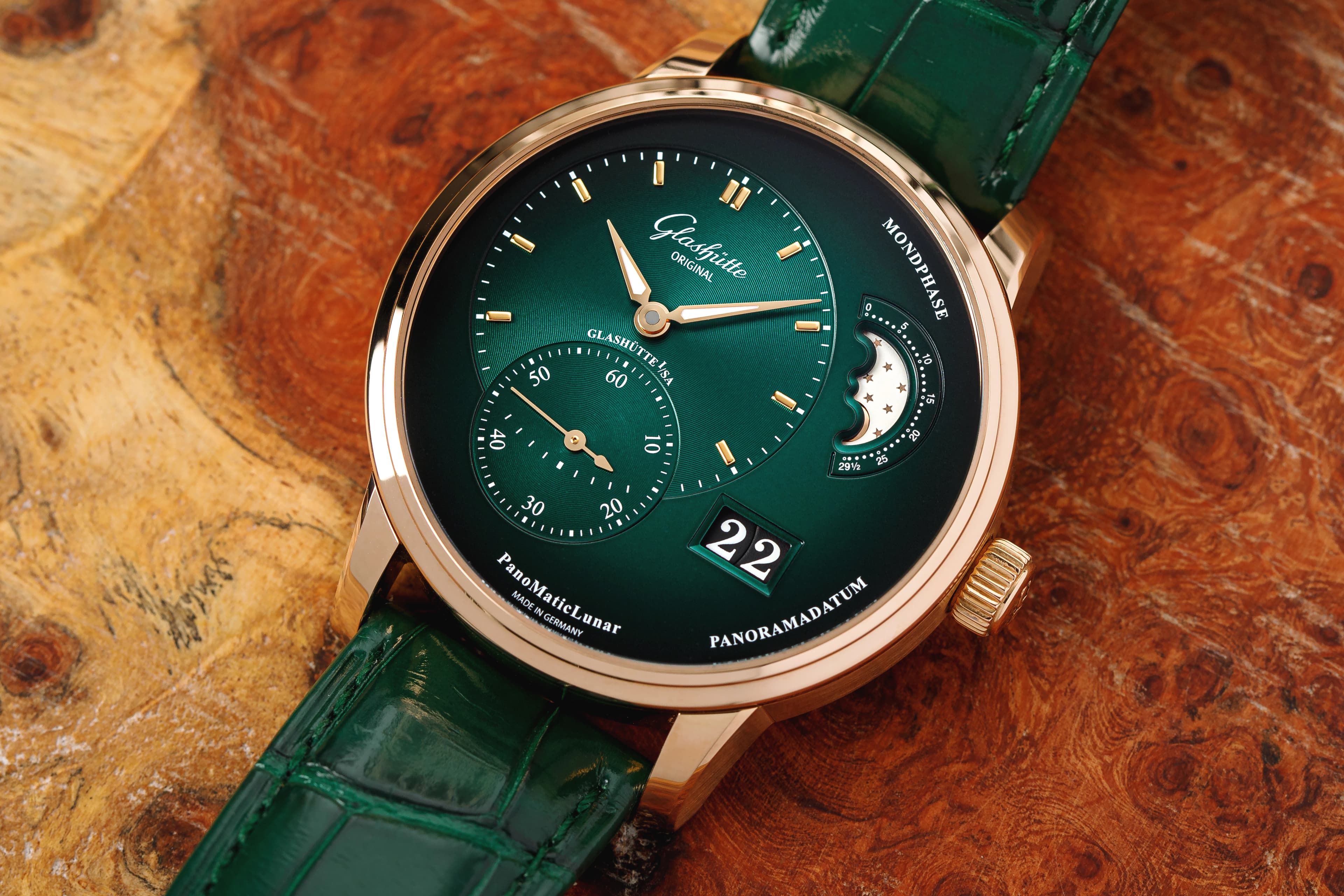
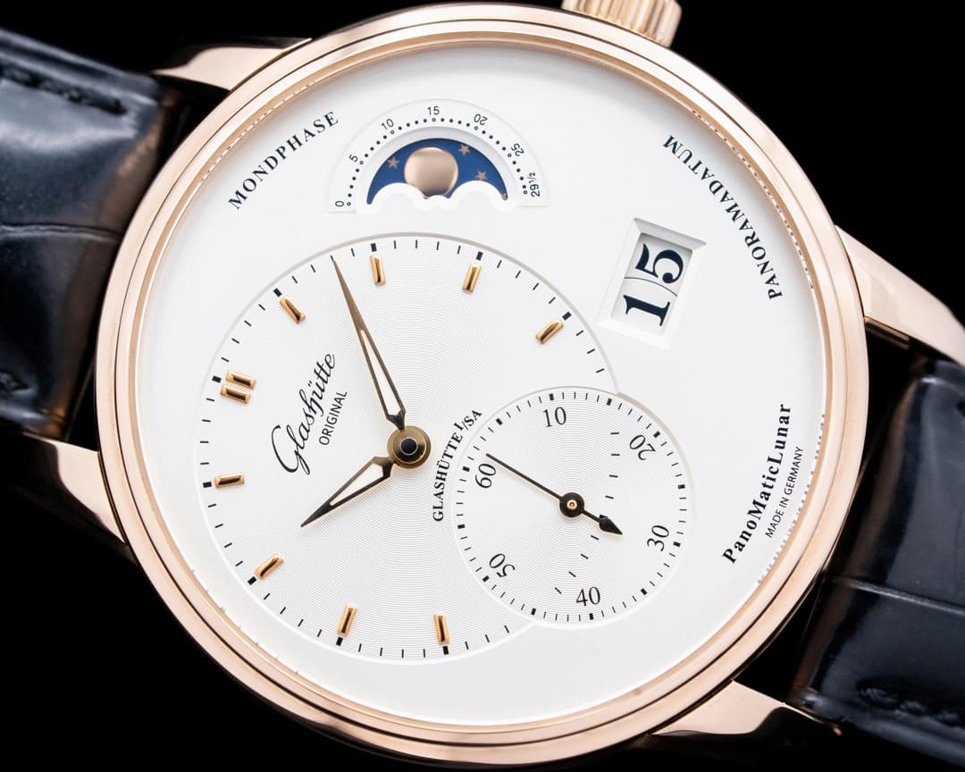
Glashütte Original PanoMaticLunar
Asymmetry is often mistaken for imbalance. The PanoMaticLunar proves otherwise. By shifting the time display off-center, Glashüette Original creates room, literal and visual, for complications to breathe. The date, presented via the brand’s signature Panorama Date, feels intentional rather than invasive. It reinforces the dial’s geometry.
This separation of responsibilities - time over here, celestial romance over there, date calmly occupying its own space - turns asymmetry into a form of order. The result is a dial that feels composed, architectural, and confident. Nothing is fighting for attention. Everything knows its role.
Oris Big Crown Pointer Date “Bullseye”
Pearl clutching aside, this is one of the most elegant solutions to the date problem ever devised.
Instead of cutting a hole in the dial and hoping for the best, Oris does something far more civilized: it adds a fourth hand and lets the date live on the periphery. The result is legible, intuitive, and, most importantly, symmetrical. No missing hour marker. No awkward window. No visual apology.
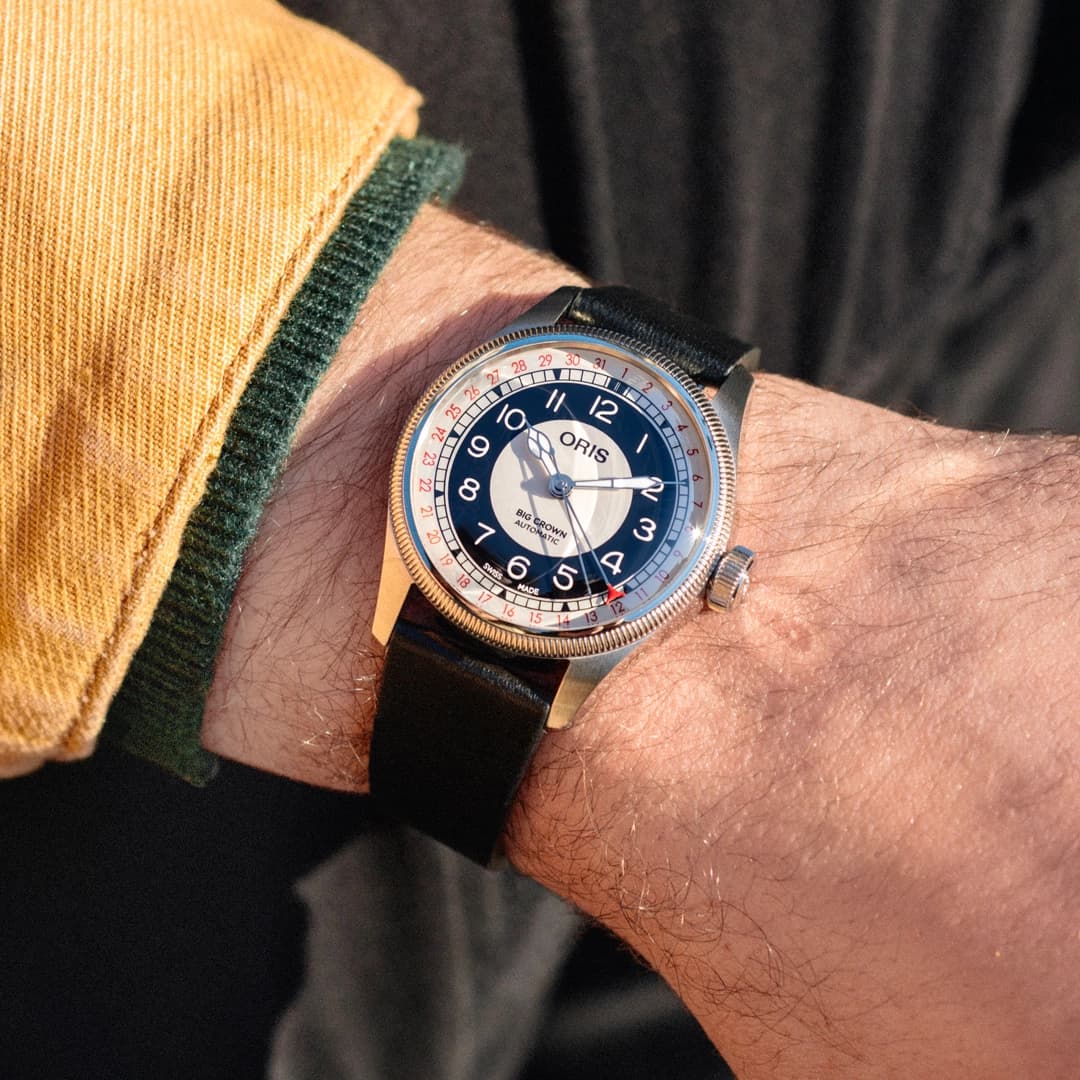
This approach isn’t a modern workaround; it’s a defining trait. “The Pointer Date is a complication developed by Oris that has been in our line since 1938. It is an iconic design that uniquely displays the date while keeping the symmetry of the dial. We view this design as part of the core of who we are. With the Bullseye, we wanted to have something with a classic design and truly vintage feel that paid homage to our long history in watchmaking. The Pointer Date was the natural choice of complication for this piece,” said VJ Geronimo, CEO of the Americas for Oris.
The Bullseye leans into mid-century warmth with its two-tone dial and oversized numerals, but the pointer date keeps everything grounded. It feels intentional rather than ornamental, a functional solution that also happens to look fantastic. In a debate where many date windows feel like compromises, the Big Crown Pointer Date stands out as proof that sometimes the answer has been there all along.
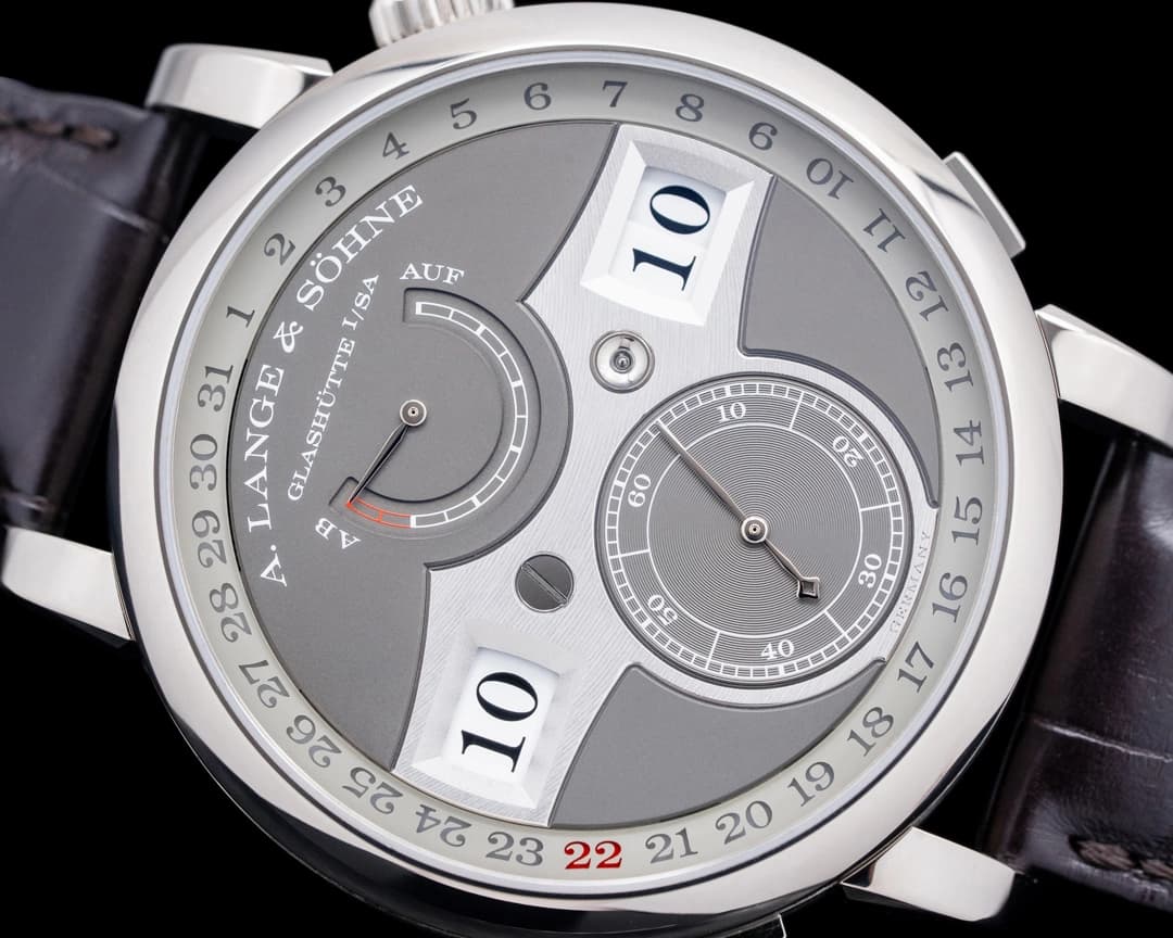
A. Lange & Söhne Zeitwerk Date
The Zeitwerk already broke one rule by displaying time digitally through mechanical means. Adding a date could have been disastrous. Instead, Lange pushed the date outward to the periphery of the dial. A subtle ring, punctuated in red, marks the date beneath the sapphire. It’s visible without being dominant, present without being invasive.
By allowing the center of the dial to remain focused on its jumping numerals, the Zeitwerk Date keeps its identity intact. This is a watch that understands hierarchy. Time comes first. Everything else follows.
NOMOS Tangente Neomatik 41 Update
NOMOS has always understood something crucial about dates: if they’re going to exist, they must behave. Rather than using a date window, the Tangente Neomatik 41 Update also pushes the date to the periphery of the dial. Small cutouts flank the current date, highlighted by a rotating disc beneath the surface. There’s no extra hand, no visual disruption, just information revealed when needed. The Tangente remains unmistakably itself, merely updated.
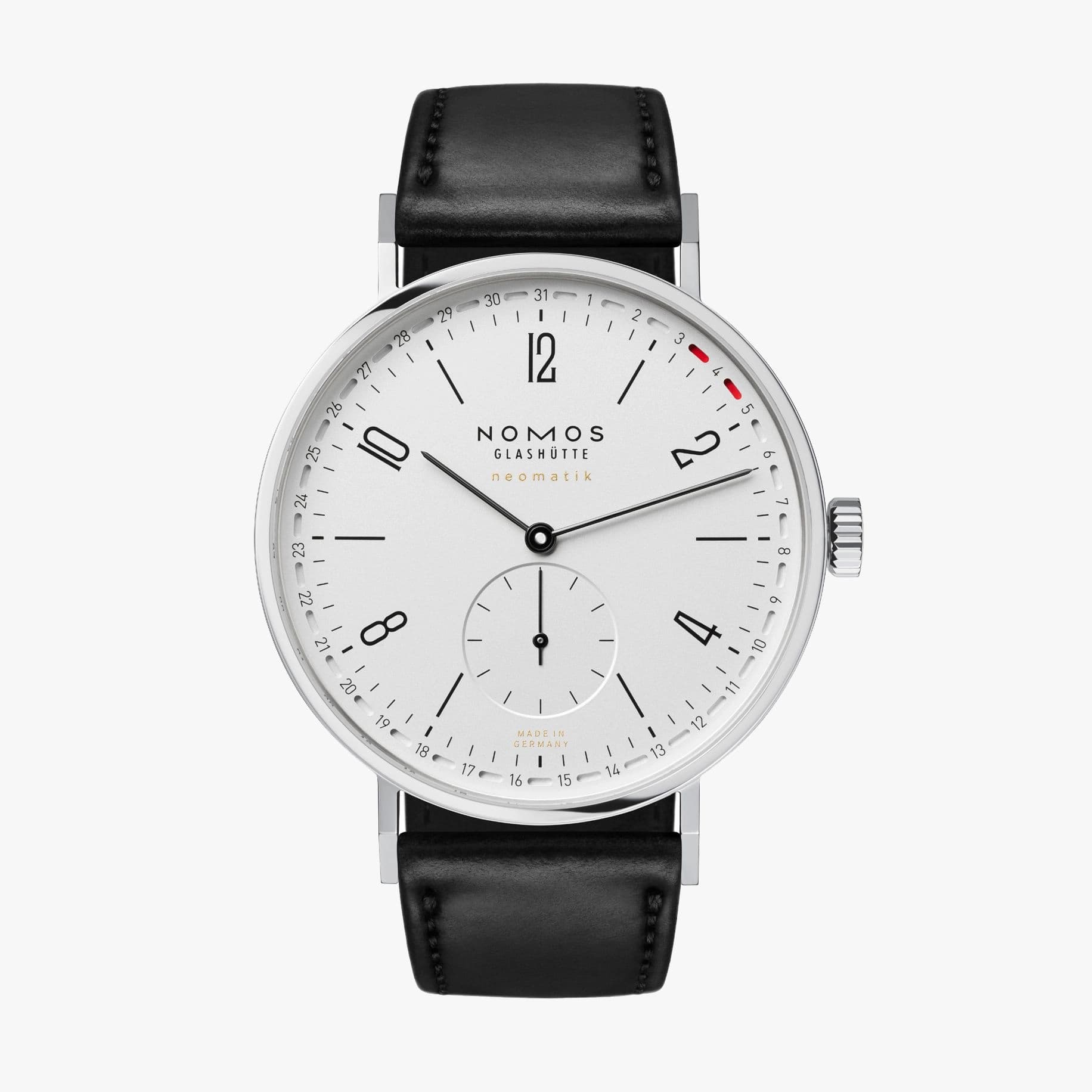
The word “update" is doing a lot of work here, deliberately so. “The core characteristic of a NOMOS watch for me is that design and mechanics go hand in hand. They have to be considered together. The new ring date shows what the caliber behind the dial can do. And its red markings underline Tangente’s character,” said Michael Paul, product designer for NOMOS. “The goal was to let the NOMOS Caliber DUW 6101 movement lead the design.”
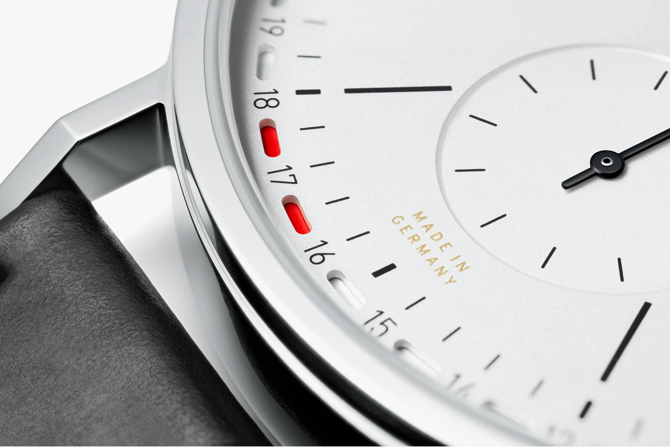
That philosophy is visible at a glance. The dial isn’t reinvented, it’s respected. Paul has described working on the Tangente as a kind of tightrope walk, balancing reverence for a classic with the desire to evolve it, and the peripheral date is the result of that restraint.
It’s balanced, legible, and unmistakably NOMOS, proof that a date complication doesn’t have to shout to be heard.
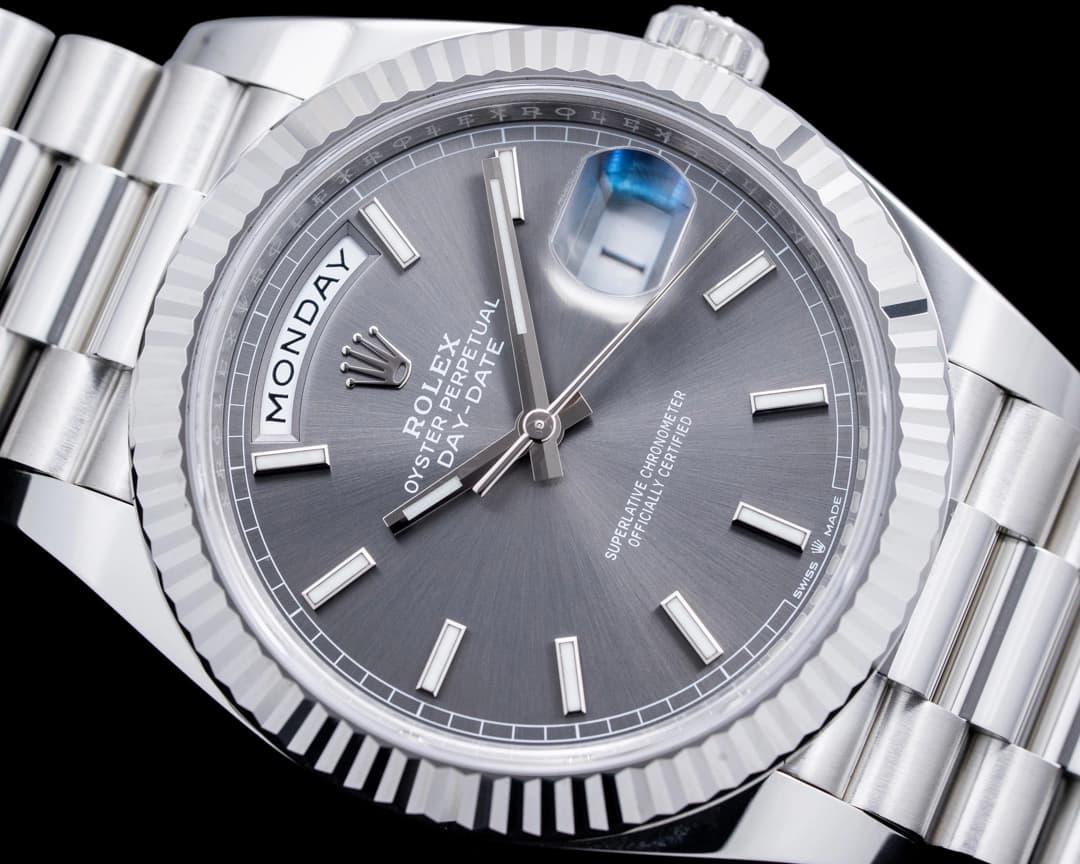
Rolex Day-Date
Few watches have a résumé like the Rolex Day-Date. Introduced in 1956 as the first wristwatch to spell out the day in full, it didn’t just become iconic; it became symbolic. Power, success, authority. The “President” nickname wasn’t accidental.
But placed alongside today’s more nuanced date solutions, the Day-Date starts to feel immovable. The fully written day at 12 o’clock devours the marker and spills toward eleven and one, while the Cyclops magnifier adds literal height and visual noise to an already assertive design. It’s legible. It’s unmistakable. It’s also unapologetically heavy-handed.
Is it classic? Absolutely. Is it outdated? Also yes. The Day-Date doesn’t evolve because it doesn’t believe it needs to, and in a debate about design harmony, that stubborn confidence is either its greatest strength or its most glaring flaw.
The Case for No Date
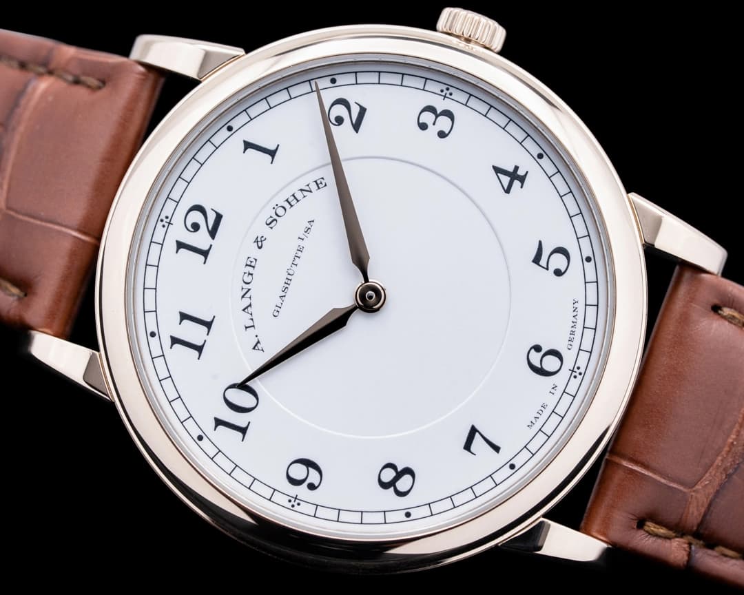
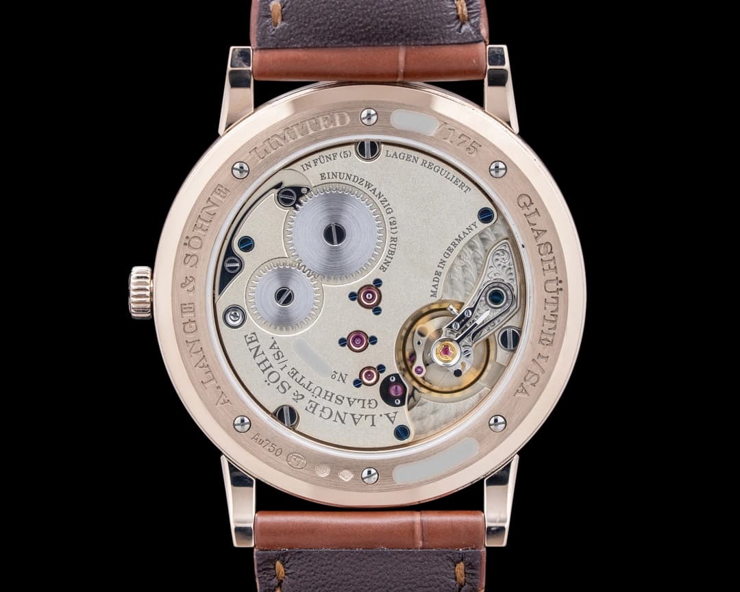
A. Lange and Sohne 1815 Thin
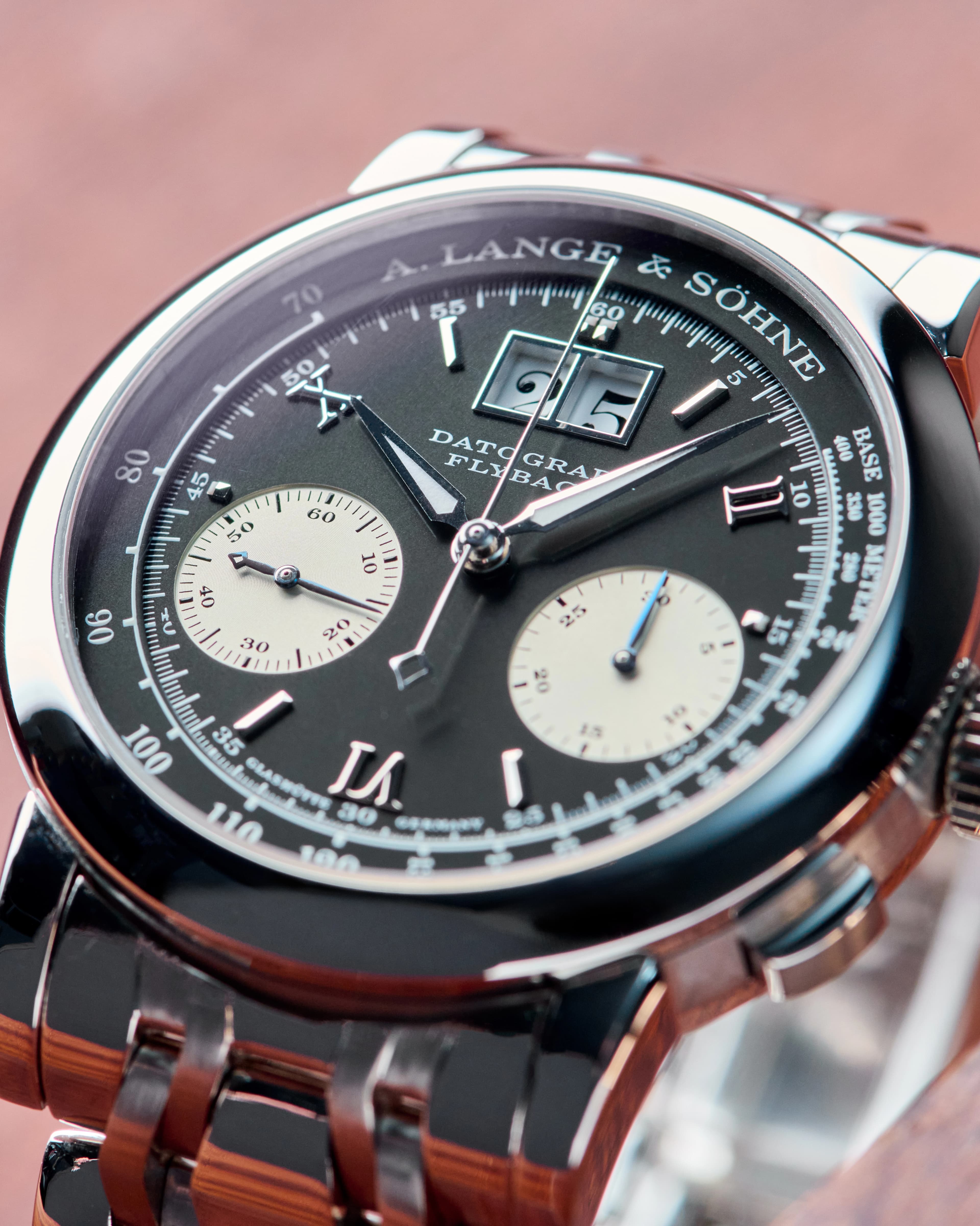
A. Lange & Sohne doesn’t need complications to make a statement. The 1815 Thin Homage to F.A. Lange eschews not only the date, but even the running seconds. What remains is pure form: clean lines, beautiful finishing, and proportions that feel almost meditative. It’s a reminder that watches don’t need to do more to be more.
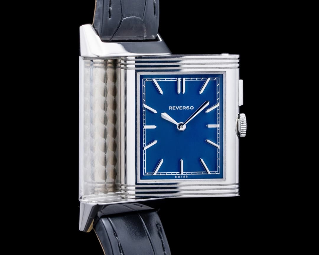
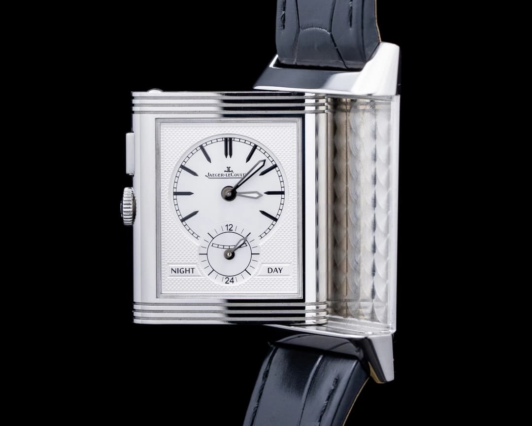
Jaeger-LeCoultre Grande Reverso Duoface
Symmetry can be intoxicating. On the main dial, the time-only display allows the lacquered blue dial and classic Reverso case to do all the talking, while the second time zone displayed on the second dial on the reverse is interrupted only by a perfectly symmetrical 24-hour day/night indicator. All the information the wearer needs is available with the flip of the swiveling mid-case. The absence of a date isn’t a compromise; it’s intentional.
Patek Philippe Golden Ellipse
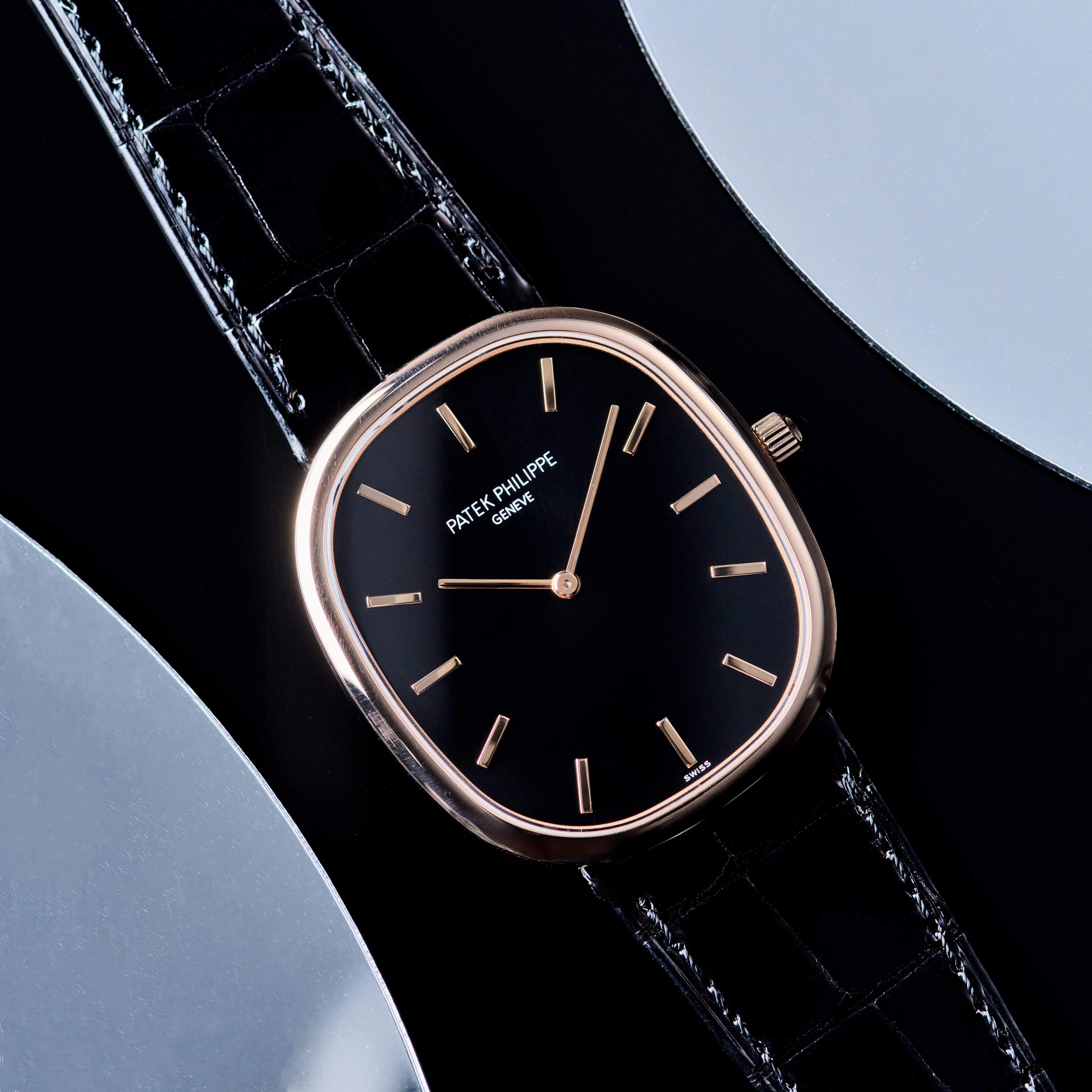
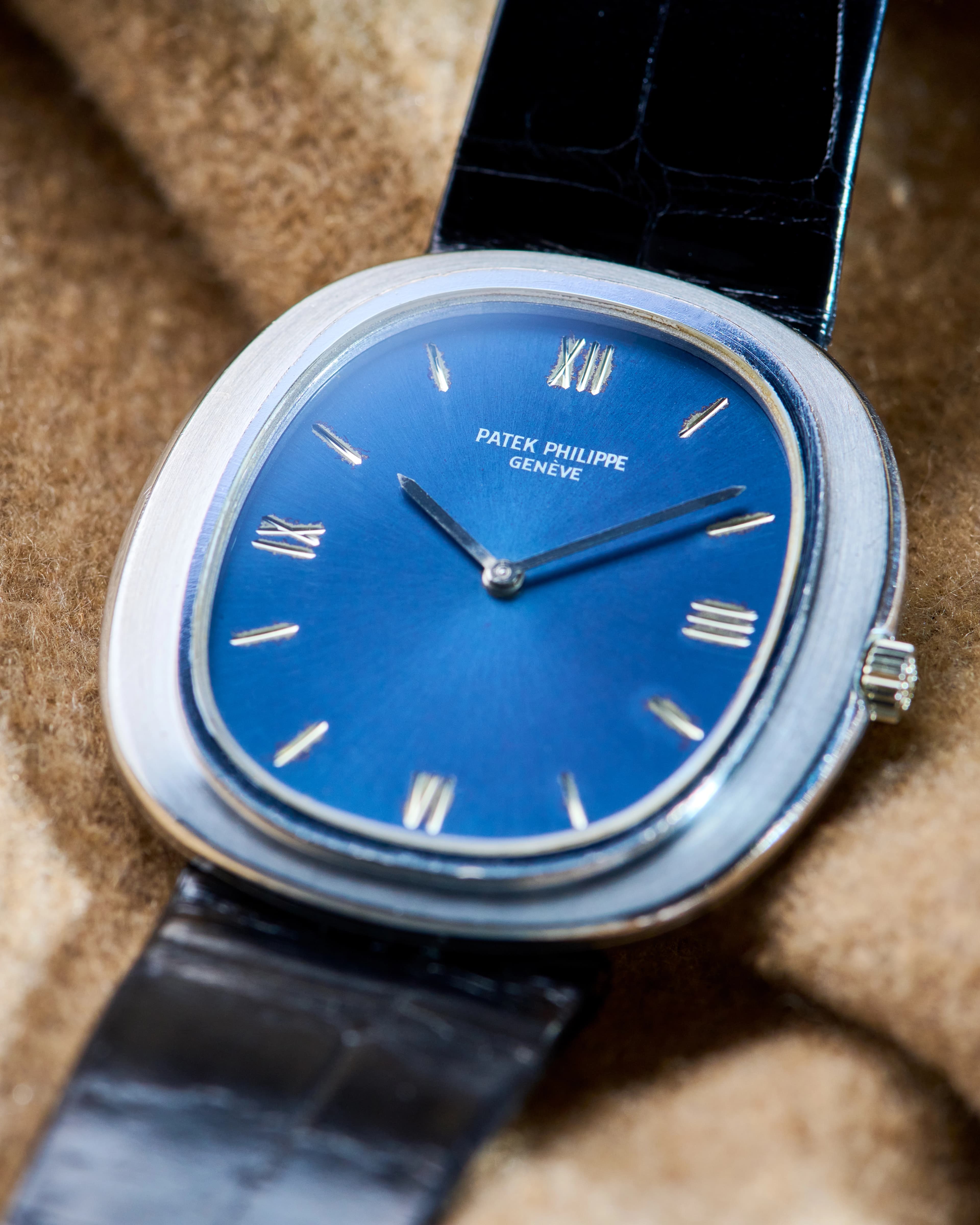
There is a particular confidence in restraint. The Golden Ellipse doesn’t need to justify itself. Its two hands, elegant proportions, and immaculate finishing create a watch that feels complete as-is. A date would introduce noise where none is needed. This is a watch for the wearer, not the room. Its beauty isn’t performative, it’s personal. Quiet. And that kind of elegance doesn’t require additional information.
Rolex Oyster Perpetual
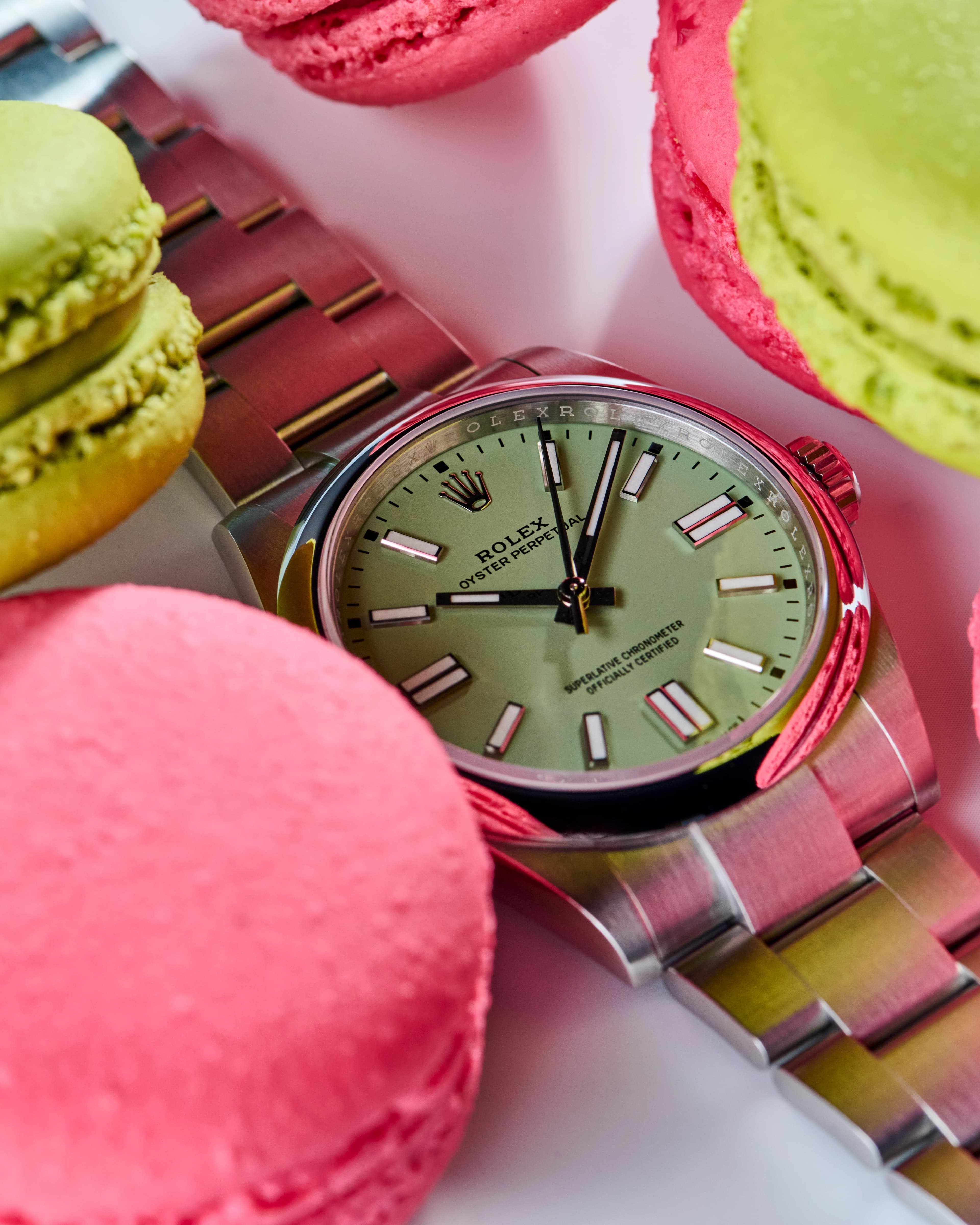
Strip away the cyclops. Remove the date. Forget the day. What’s left is the archetype. The Oyster Perpetual is the watch distilled to its essence. Robust, legible, endlessly adaptable, and immediately recognizable. Change the color, change the size, but the formula remains undefeated. This is the watch everyone imagines when asked to “draw a watch.” And it doesn’t miss the date for a second.
The Question Remains… Date, or No Date?
For some, the date is a daily necessity, proof that a watch is a tool, not a jewel. For others, it’s an aesthetic crime scene: symmetry violated, harmony disrupted, dial furniture rearranged to accommodate a number that already lives in every pocket, bag, and wrist-adjacent rectangle of glass known to modern life.
The modern watch landscape offers choice. Incredible choice. Date watches that respect design. No-date watches that revel in purity. Solutions that range from ingenious to gloriously stubborn. Buy what you like. Wear what speaks to you. There is no wrong answer.
And yet… it’s hard to ignore that many of the most impressive date watches exist to solve a problem they didn’t need to create in the first place. In an age of phones, computers, dashboards, and digital assistants, the date is never more than a glance away. What is harder to come by is something beautiful. Something balanced. Something uninterrupted.
If a watch can have both clarity and elegance, it's wonderful. Celebrate it.
But when forced to choose?
The dial, untouched and unburdened, quietly smiles back.
Shop New Arrivals

5970G Perpetual Calendar Chronograph 18K White Gold Silver Dial
$235,000
View Watch
Nautilus 5980 Chronograph SS White Dial
$135,000
View Watch
5980/1AR Nautilus SS / 18K RG Blue Dial
$109,900
View Watch
3003 Ingenieur SL SS / 14K YG Black Dial
$24,500
View Watch
Shop New Arrivals

5970G Perpetual Calendar Chronograph 18K White Gold Silver Dial
$235,000
View Watch
Nautilus 5980 Chronograph SS White Dial
$135,000
View Watch
5980/1AR Nautilus SS / 18K RG Blue Dial
$109,900
View Watch
3003 Ingenieur SL SS / 14K YG Black Dial
$24,500
View Watch
More Content
