
Watches are all about the details. Millimeters separate a “perfectly proportioned” watch from a garish behemoth, and a dot over 90 on an Omega Speedmaster bezel—instead of to the side—can greatly increase the value and collectibility. We obsess and often argue with each other incessantly about these details on modern and vintage watches. Every new watch release is met with a multitude of competing opinions that we debate about in the comments of our favorite watch blogs. Of all those debates there is one that in my mind seems to stand above the rest in the current watch zeitgeist. That issue is the pros and cons of faux patina—or fauxtina as it is commonly referred to.
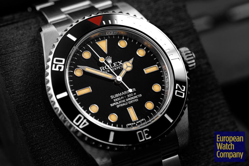
Fauxtina is when a designer makes a watch look like it has the same characteristics of a vintage watch that gained those traits through aging. The most common way to do this is to color the lume on a watch shades of off white or light brown. This mimics the discoloration that can happen over time with radium or tritium lume. Modern watches no longer use this type of luminous material since safer and more stable options like Super-LumiNova came into use in the mid-’90s. These newer luminous materials don’t age the same way, meaning there aren’t going to be newer watch models that gain this desired trait over time. Until recently—most likely the mid 00’s—the only way you could get a watch that had the warmth and character of a vintage watch was to actually buy a vintage watch! Also, and this is a key point, modern watch companies don’t make any money off vintage watches. A watch company’s goal is to entice you to buy a brand new watch.
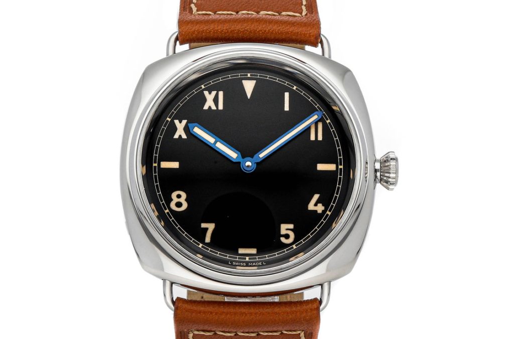
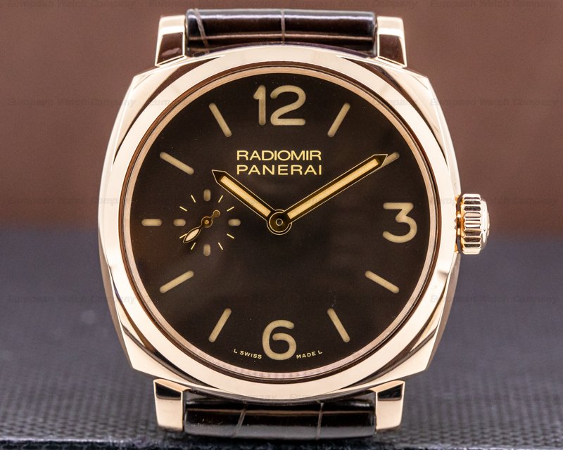
When the vintage watch market started to pick up steam in the mid-’00s, watch brands started to notice. While it’s hard to pinpoint exactly, it looks like the first watch to have its lume colored to resemble a vintage watch is the Panerai Radiomir 1936 PAM00249. Panerai modeled the watch after a watch made in—you guessed it—1936. The vintage design cues are unmistakable and the fauxtina is well done. It’s restrained and actively adds to the design of the watch. After this watch, the vintage-inspired pieces get more popular bringing with them yet more fauxtina to fight over. There is a solid case for and against fauxtina.
Against faux patina right out of the gate is the inherently negative name. Faux means made in imitation, fake, or artificial. Patina is another word for aging that usually refers to the desirable aesthetics that come from said aging. Fake aging doesn’t give anyone the warm fuzzies. Can you imagine someone at a watch meetup saying, “I love how artificial that dial looks.”? No. In a world obsessed with authenticity and originality, fauxtina goes against what we usually look for in a watch.
With that in mind, a modern watch that’s pretending to be old seems wrong. It feels like pandering on the part of a watch company when they lay on the vintage too thick. It’s a feeling that some people can’t get past and those people may never be able to buy a watch with fauxtina. The watch didn’t earn its stripes and that just doesn’t sit right. Yet for me, there are some well-done examples out there that have come closer to making me a full convert. In particular, the Seamaster 300 in yellow or rose gold. While drooling over some photos of this watch, I realized that though the fauxtina on the steel version rubbed me the wrong way, I liked it on the gold watches. Stark white would have looked out of place with all the other warm gold tones. It was a more cohesive aesthetic choice. The same can be said for the Panerai Radiomir PAM513 seen below.
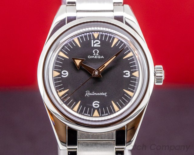
A proponent for fauxtina might suggest that it’s not fake or inauthentic, it is simply a design choice like any other—like choosing what various shades of blue will look good on a watch dial. Sometimes cream just looks better than pure white. Vintage-inspired sure, but it’s not a bad thing to get design inspiration from somewhere new, or old in this case. A watch dial that takes inspiration from instruments on a car dashboard isn’t pretending to be a speedometer. Inspiration comes in all forms and helps us push design forward into new and exciting places. Cream-colored lume plots weren’t thought of 40 years ago, but now that we can see how great they look on a vintage watch we can apply that same warmth to a modern watch. It’s a look that serves a different purpose.
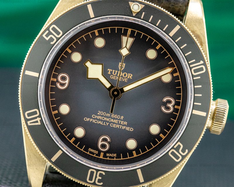
A modern sharp Rolex Submariner with its black dial and stark white lume has a surgical precise look to it. It’s meant to represent what Rolex envisions as a perfect dive watch. A Tudor Black Bay Bronze, on the other hand, is a little more relaxed and casual . Its vintage-inspired queues make it more inviting. Patina is mother nature one-upping us, showing us that while we can make beautiful watches, she knows how to imbue them with a warmth and friendliness we never thought of. Faux patina may just be us agreeing that mother nature is a better designer.
Previous Article
Time Travelers: The Patek Philippe World Time Watches
Next Article
Why The Hype: The FP Journe Chronometre Bleu
Join 75,000+ Other Watch Enthusiasts
Get our new arrivals first.