Why Some Watches Become Icons: Key Design Details
Published on 4/28/2026
Watches walk a tightrope between function and design while trying to appeal to their intended consumers. Some enthusiasts might pontificate on spec sheets, but there’s more to a watch than water resistance, beat rate, and accuracy. Brands that have staying power create icons, and to create an icon, you have to do something different. There has to be a design element, or a collection of elements, that fuse as a whole and add up to more than the sum of the individual parts. The curve of a lug, the shape of a crown, the texture of a dial…any and all of these things have the potential to be a design signature that assists in defining a brand.
“When I think of iconic watch design details, I think of the sort of tiny hint of something that you see poking out of a sleeve across a room and instantly know exactly what it is,” said Rebecca Struthers, renowned watchmaker, writer, and historian. That instant recognition is what brands strive for.
Some brands luck out and find their footing from the word “go”, but most are the result of more than a century of evolution, in which the wristwatch industry itself transformed from creating delicate curiosities to crafting purpose-built tools, and eventually objects of personal expression. Early wristwatches, many of which were adapted from pocket watches or designed as jewelry, weren’t defined by brand language so much as they were by utility or novelty. Yet, as watchmaking matured, spurred by industrialization, e.g., timing trains, wartime necessity, and a growing hunger for portability, design began to take on a different role. This started the slow shift from telling the time to how time would be presented and remembered.
While the flourishes that will be mentioned are small, they’re hardly accidental. “I love it when you see watchmakers carefully curate signature details that allow them to play with designs whilst maintaining a coherent style,” explained Struthers. It’s a balance of variation and detail without losing the overall design. For example, a maker like Kari Voutilainen can explore a wide range of dial designs, techniques, and textures, yet remain instantly recognizable through a handful of consistent elements. “You could have 100 of his watches alongside each other, each with a different dial, and they still look like a family,” she said.
That sense of continuity is what gives iconic brands and watches their staying power. Movements evolve, materials change, and trends come and go, but these design elements remain; refined, reinterpreted, but rarely abandoned. These through-lines connect a brand’s past to its present, turning individual watches into part of a larger story.
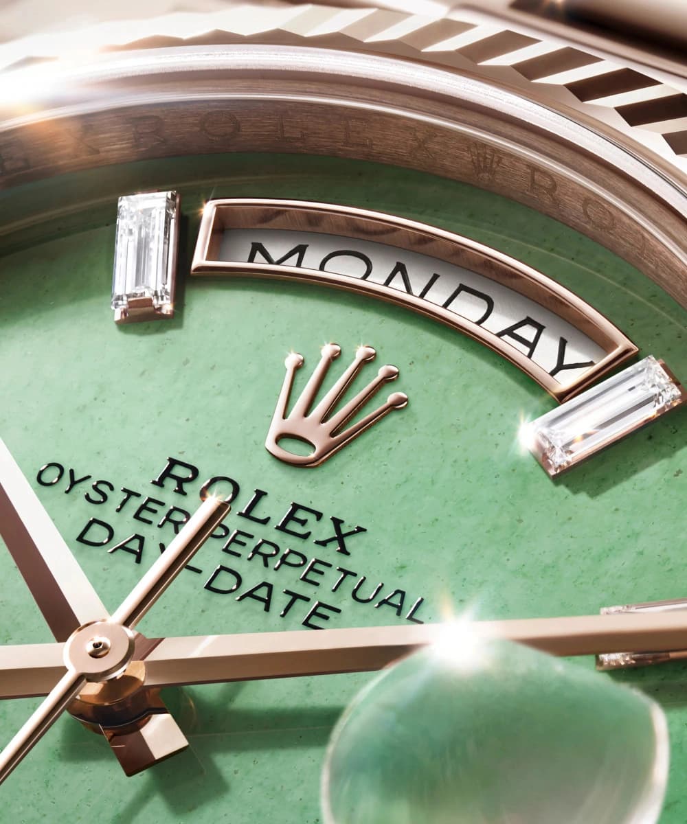
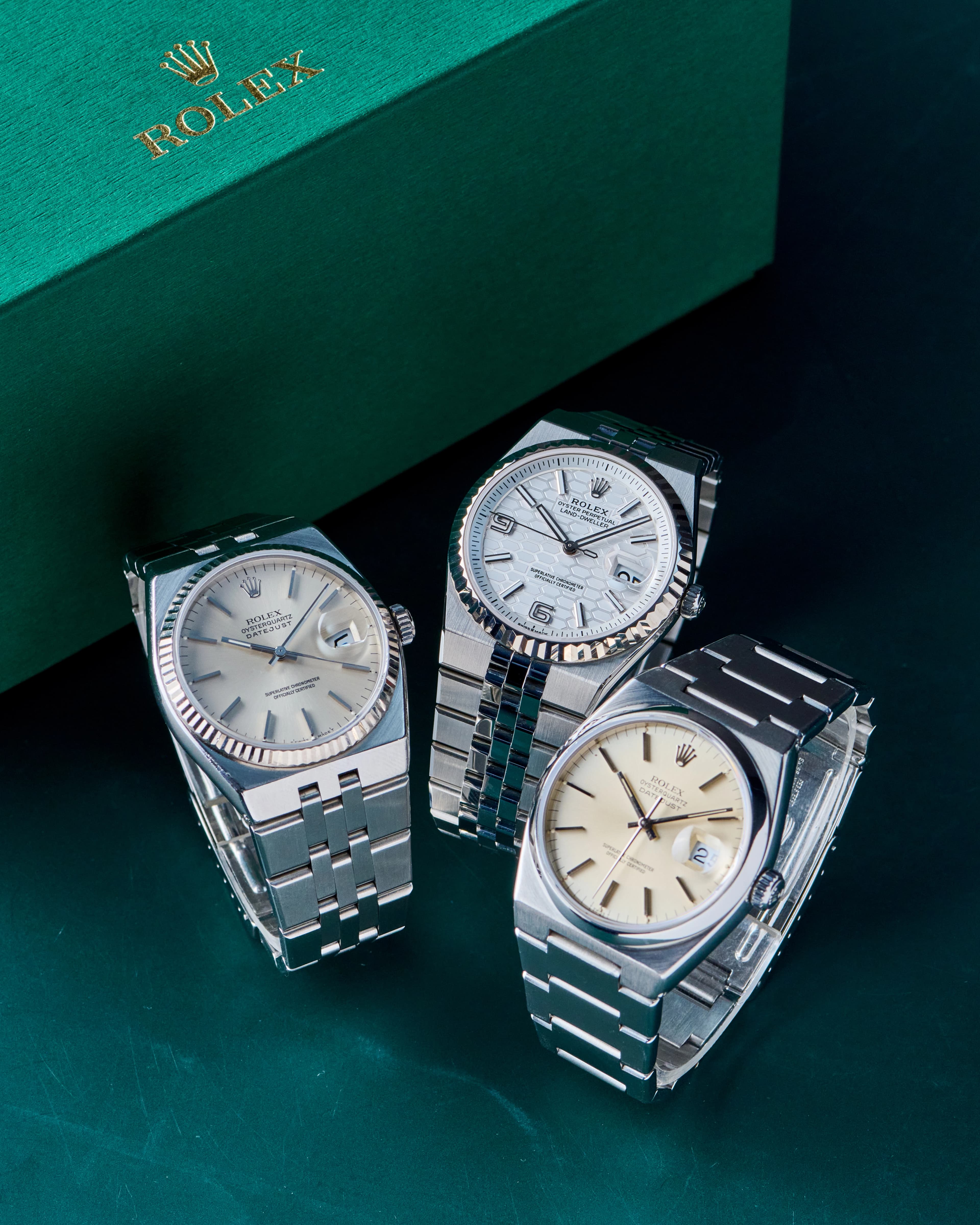
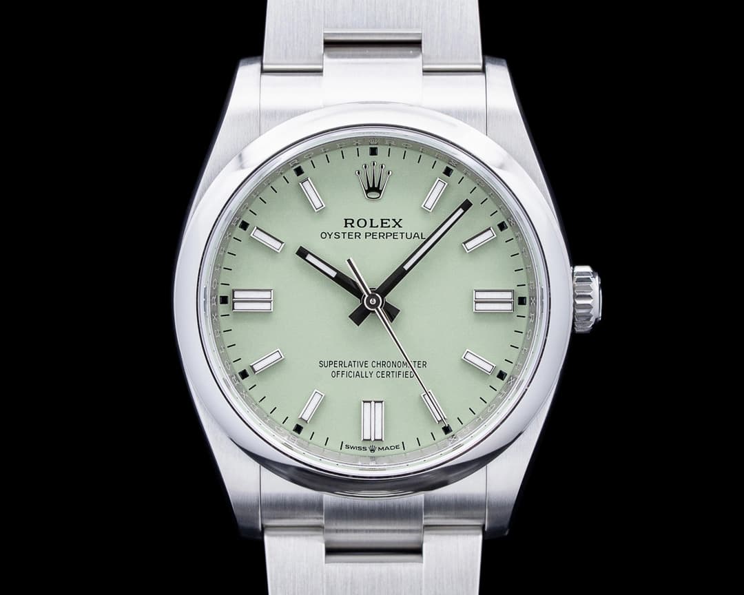
100 Years of the Rolex Oyster Case: Functionality Becoming Identity
If there is a single design innovation that captures the evolutionary shift in watch design from timekeeping tools with a purpose to something dependable and design-forward, it’s the Rolex Oyster case. And in 2026, it turns 100.
A century might seem like a long time, but in the grand horological scope, it’s barely a warm-up. The Oyster case exemplifies the brand's longevity, yet it’s the perfect example of a technical solution that became the brand's most definitive design aesthetic, with its original function serving as the anchor for the other watches in the Rolex catalog.

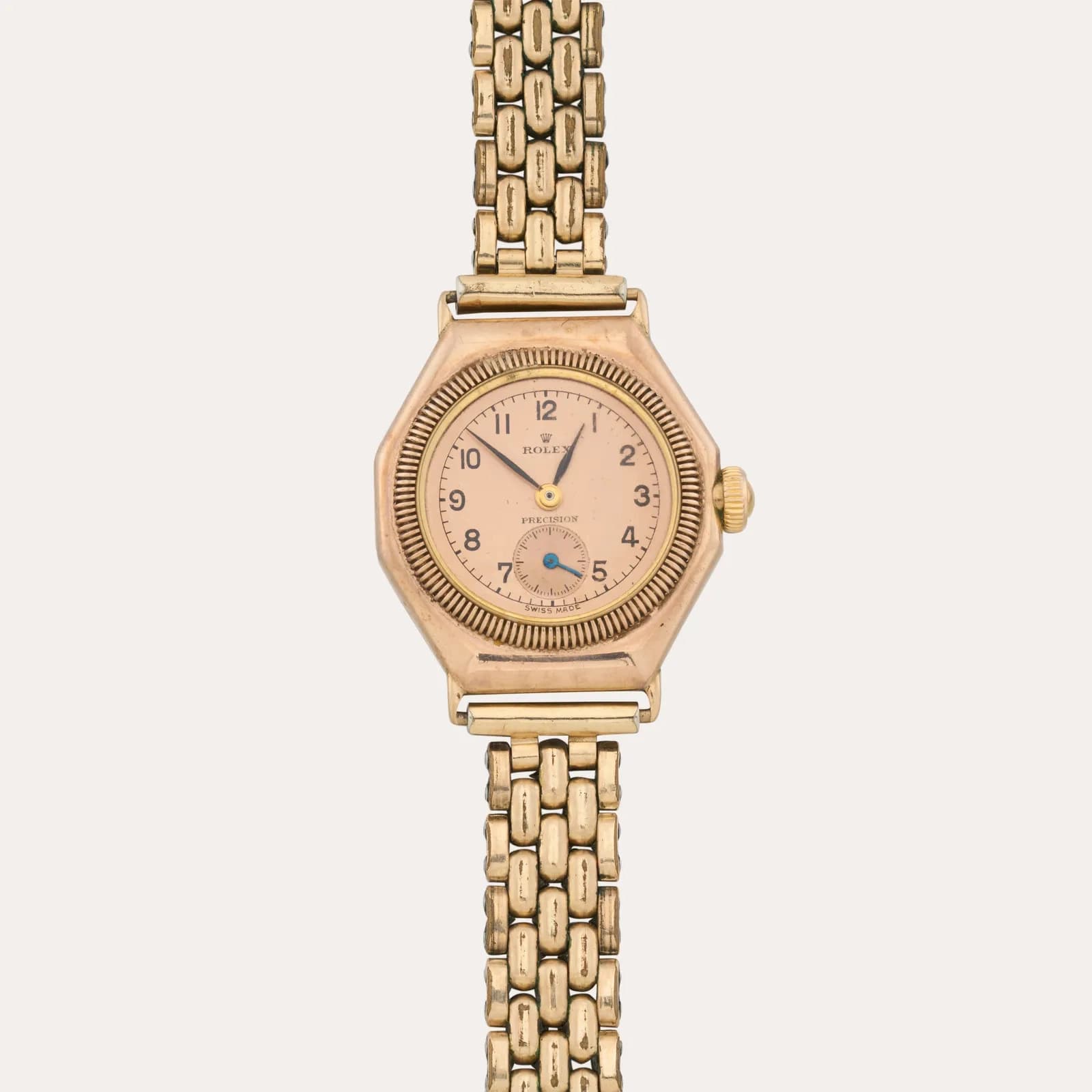
Early on, when it came to developing watches, it was all about timekeeping and the survival of the mechanisms. Dust, moisture, and all of life’s little indignities found their way into the cases of early watches. Many brands experimented with solutions for water resistance and general protection of a watch’s movement, but in 1926, Rolex delivered something that really worked and was easily marketable. By screwing down the bezel, caseback, and crown to create a hermetically sealed environment, the Oyster case was born.
Since then, nearly every brand has developed functional, protective cases for their watches. Yet, what makes the Oyster case interesting is not what it was capable of doing early on - it’s what happened next.
In solving the problem of water resistance and protection, Rolex accidentally (or very intentionally, depending on how much credit you give Hans Wilsdorf’s marketing instincts) created a visual language. The need for a screw-down system led to the development of tools to grip the case, which in turn helped shape elements like Rolex’s recognizable fluted bezel, which was originally purely functional and now is one of the most recognizable design features in all of watchmaking in its own right.
Images: Sotheby's
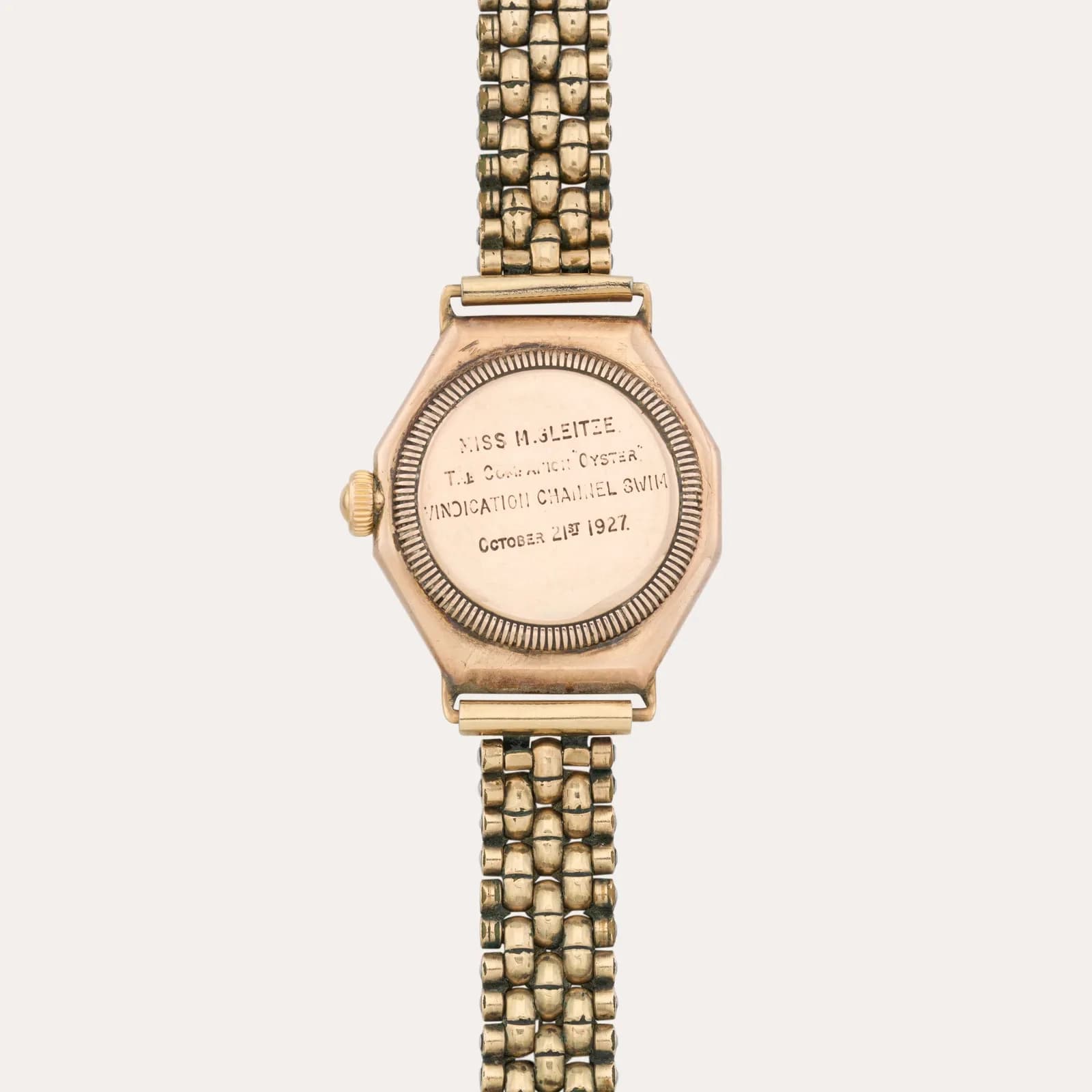
Then, Hans did what he did best: he told the world about it using the public demonstrations he had become known for. Watches were displayed in aquarium windows, ticking underwater, luring in curious crowds. Then in 1927, Mercedes Gleitze swam the English Channel with an Oyster around her neck, thus creating a story out of a case design.
If you look back at the larger idea of design and look at a Rolex, whether it’s a Submariner, a Datejust, or an OP, you’re seeing the descendant of a 100-year-old idea that has been refined, reproduced, and perfected.
The Oyster case set out to solve a problem, but went on to became a template that the entire industry would follow. While many others adopted the idea for their own purposes, Rolex retained the identity.
The Cartier Cabochon: A Little Decadence Goes a Long Way
If Rolex is the story of function becoming identity, Cartier is quite the opposite. One of their most recognizable design elements has no function; rather, it’s a functionally unnecessary flourish. Yet, some flourishes fit within a brand’s story so well that you couldn’t imagine them without it.
Enter the cabochon.
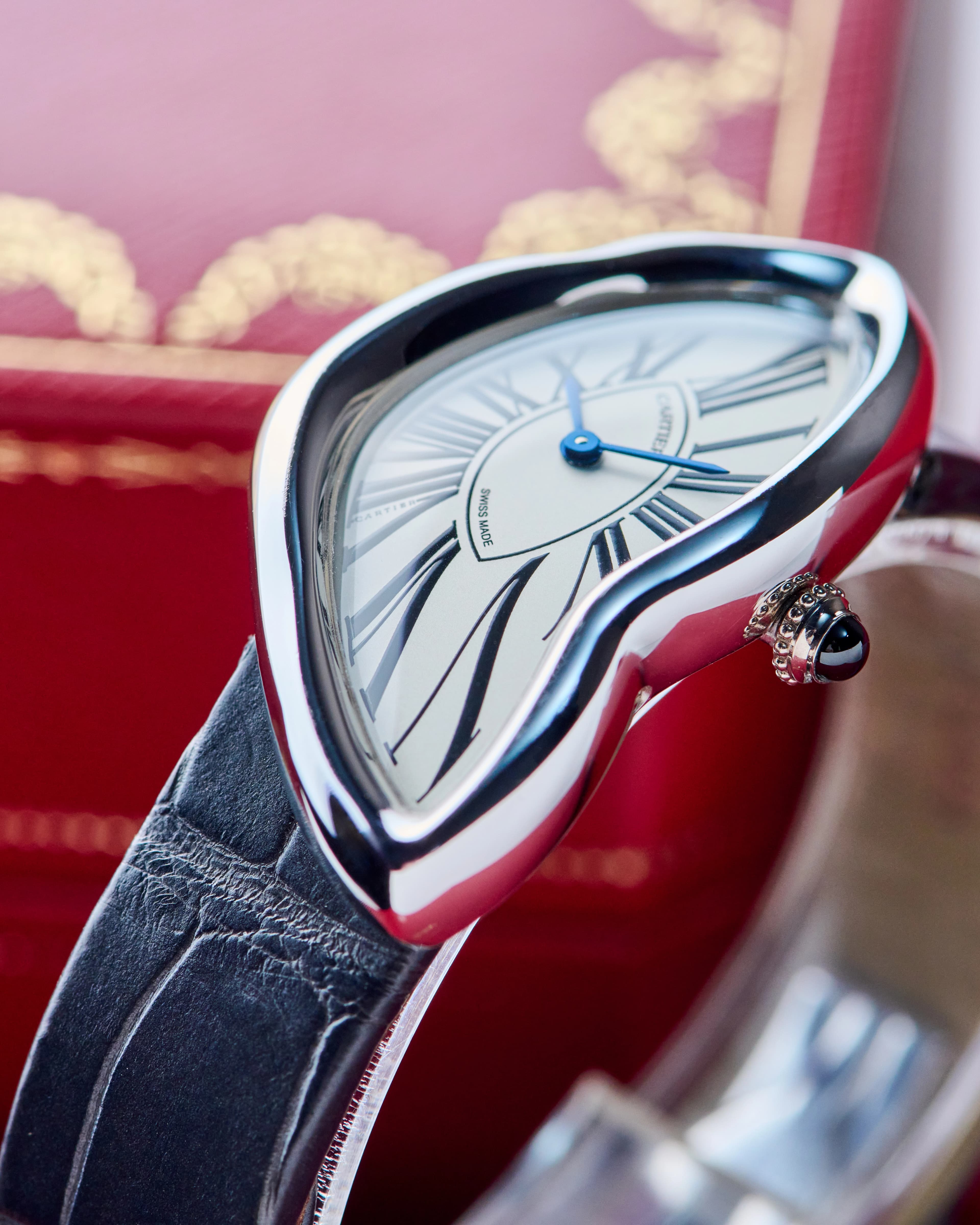
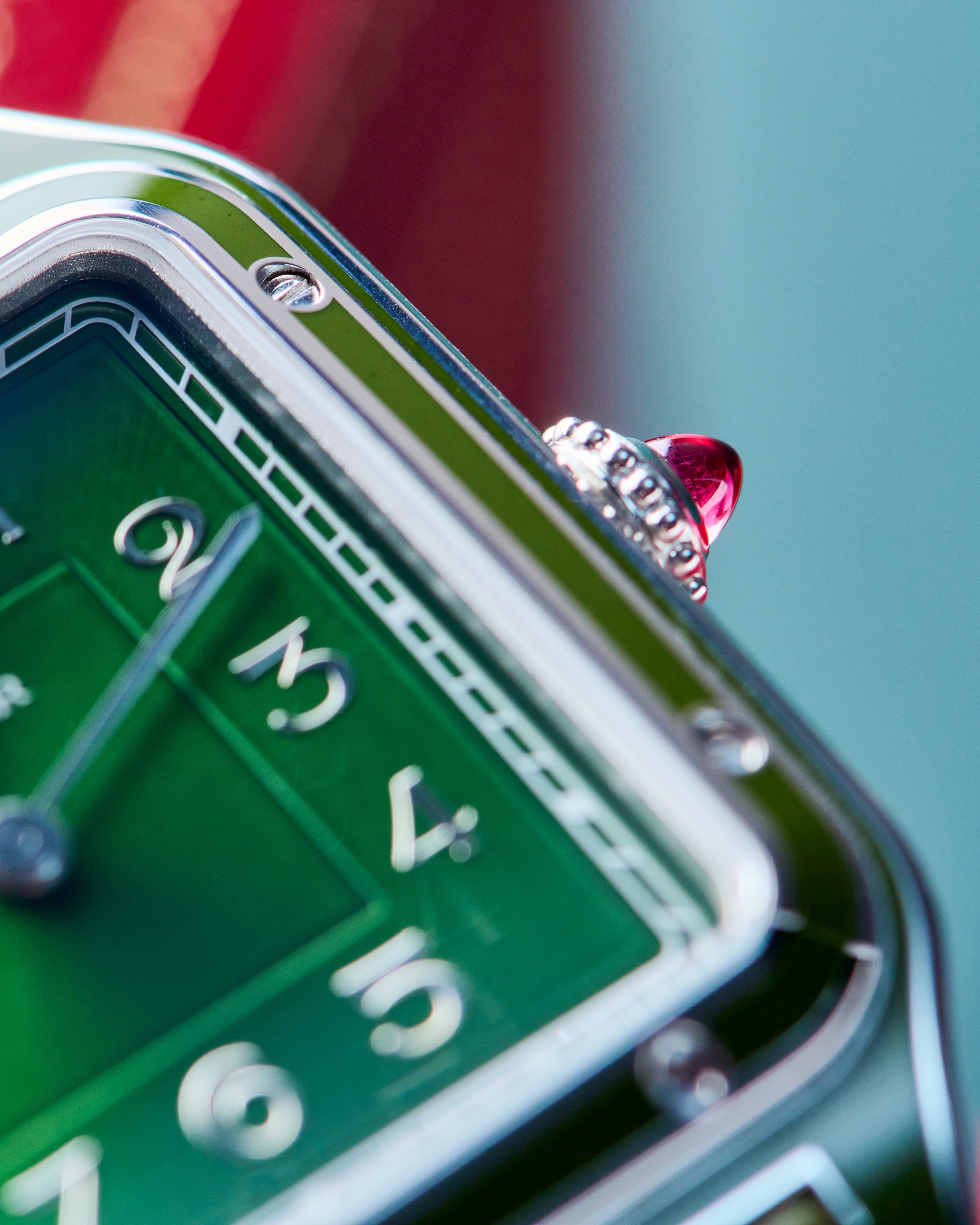
Honestly, if you’ve never handled a Cartier watch, it would be easy to miss. But once you see the small, polished stone set into the crown, you realize that the watch would feel incomplete without it. It can sometimes feel like a bit of overindulgence when viewed next to the more disciplined geometry of something like a Tank or Santos Dumont…but it works.

Because Cartier was never only a watchmaker. They are, first and foremost, a jeweler. And the cabochon is a reminder of that lineage. Long before the Tank rolled onto wrists in 1919, Cartier built its reputation on gemstones and alluring jewelry. When you think about it, they’ve been perfectly poised for the present-day watch consumer since they even conceived of making watches. The cabochon-cut stone is polished to evoke a deep glow that entrances whoever is caught in its gaze, yet it also unifies the brand as both a leader in horology and jewelry.

Not everyone loves it and it has been known to invite strong opinions. Some make the mistake of viewing Cartier as a brand that’s restrained, but they’ve always believed in flourishes. Look at the Crash, Cloche, Pebble, Pasha… all case shapes that challenge consumers’ sensibilities; the cabochon is one of the aesthetic consistencies that carries from watch to watch. It’s theatrical, but that’s the point. If you remove the cabochon from a Tank, you’d still have a Tank. But with the cabochon, you have a Cartier.
Formex and the Case of Engineered Identity
If Rolex represents the past and progress rooted in continual refinement, and Cartier embodies heritage expressed through elegance, then Formex represents a brand that has engineered its aesthetic entirely in the present.
Founded in 1999 in Biel/Bienne, Formex doesn’t have centuries of legacy to lean on. What it does have, however, is something more difficult to establish: a design language born of engineering, yet recognizable almost immediately. At the center of that identity is the brand’s line of Essence models and the use of their patented Case Suspension System.
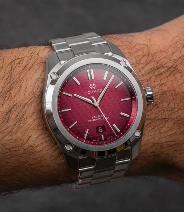
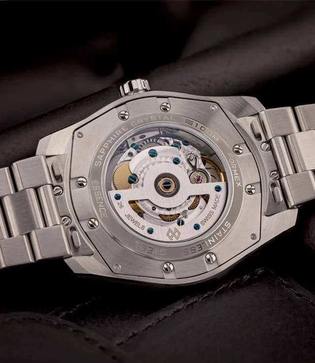
The Case Suspension System represents technical solutions to common watch issues: maximum protection for the movement inside, and comfort for the wearer. The visible screws you can see from the top view of the case aren’t just for show; they’re part of a system that allows the watch to absorb shocks and flex with the movement of the wrist. The watch has a slight give to it, a cushion-like quality that softens the rigid feeling some steel sports watches can have.
What makes this interesting is that there’s no attempt to cover the engineering - everything is on display, and the movement of the suspension system is clearly visible. The technical nature of all this has become the design. Those exposed screws, the layered case construction, and the sense that the watch is manufactured around something dynamic gives the Formex Essence an unmistakable look. It’s not just the movement inside; the entire watch feels mechanical in a more literal way.
Iconic design in watchmaking doesn’t have to take a century to obtain; sometimes it can be engineered in a fresh way from the ground up. Formex has, in essence (pun intended), forged its own path through function and design.
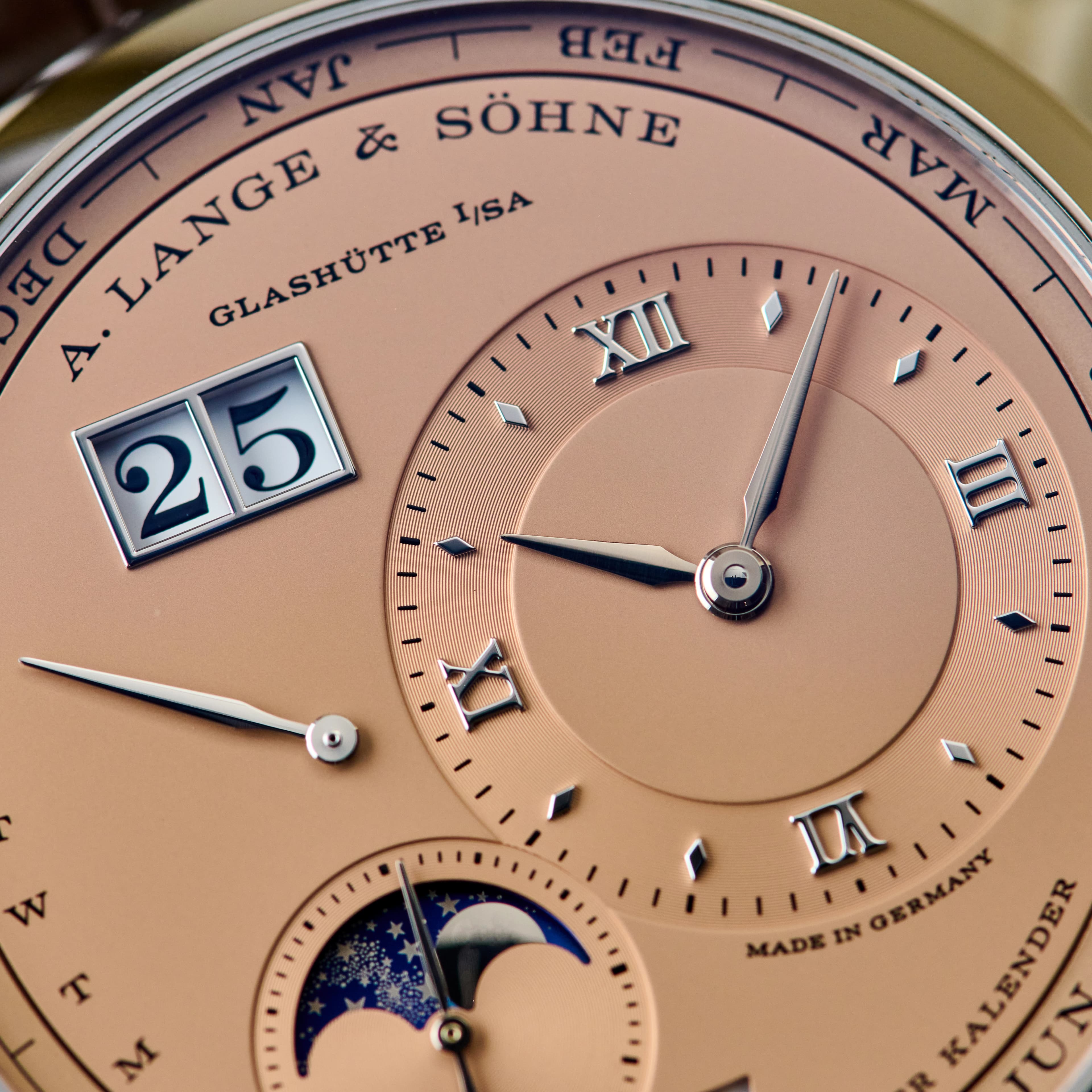
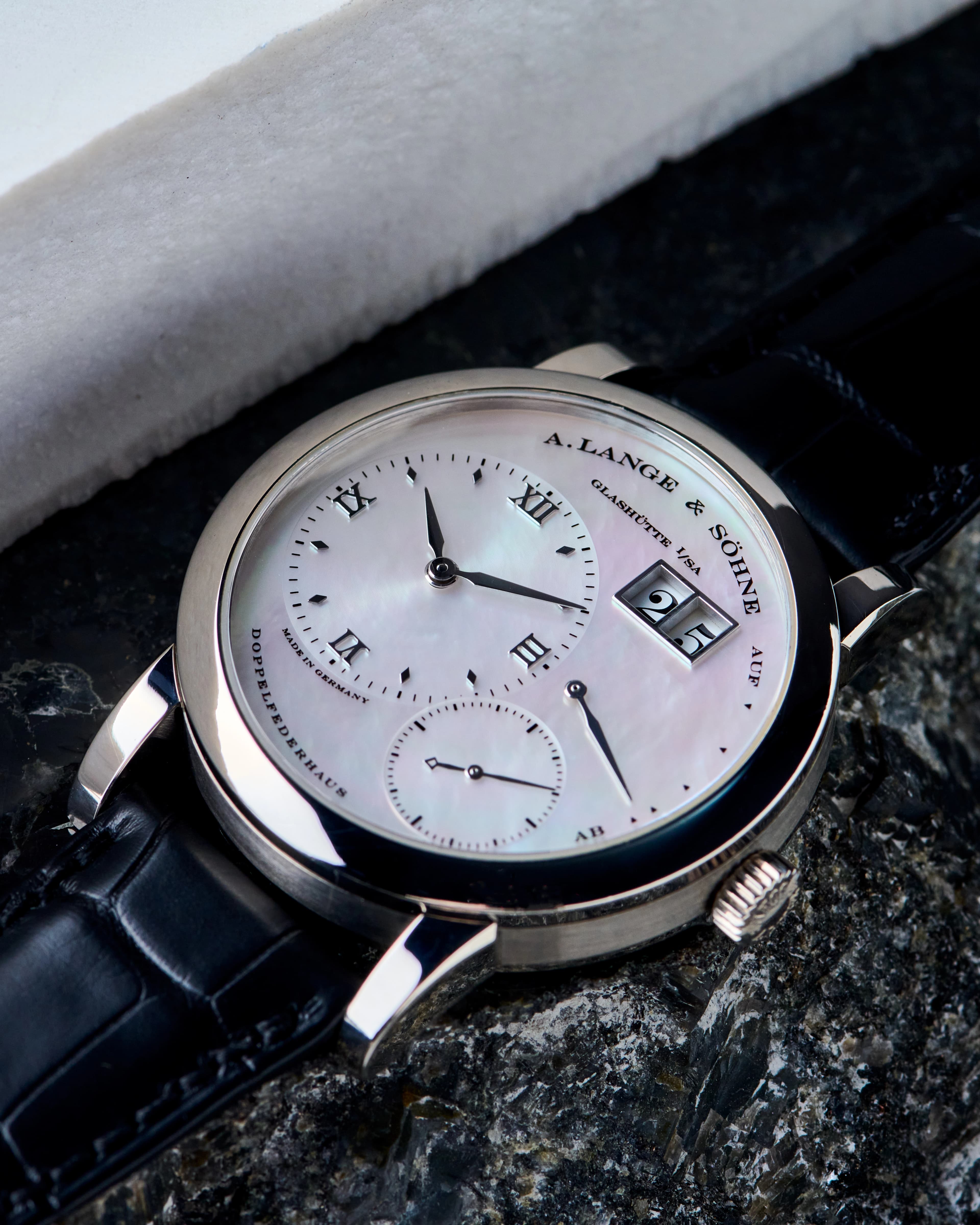
A. Lange & Söhne: When Typography and Font Become Identity
Some watches have design details that punch you square in the face. Then there are others that express themselves in a more methodical way. Font and typography sit in that second category. Often mistaken for font, which is the specific style of letters being used, typography represents the larger picture. It’s how the letters are arranged, spaced, and styled to create a cohesive visual identity. “Typography is one of the most subtle yet effective ways for a watch brand to introduce or reinforce its identity,” said watch designer Lee Yuen-Rapati.

A. Lange and Sohne
345.056 Lange 1 Perpetual Calendar 18K White Gold Salmon Dial LIMITED
$130,600
A. Lange & Söhne uses a font that goes beyond just the brand name; it is their identity. And like the brand itself, it carries a sense of history that has been tumultuous, evolving, and deeply considered.
Lange, in a sense, has been defined by disruption. Founded in the 19th century in Glashütte, and shut down in the aftermath of World War II, they were reborn in 1994. They’re a luxury brand defined by a broken narrative. Yet they have a proven ability to reconstruct themselves, and, in its way, typography plays a surprisingly central role in that process.
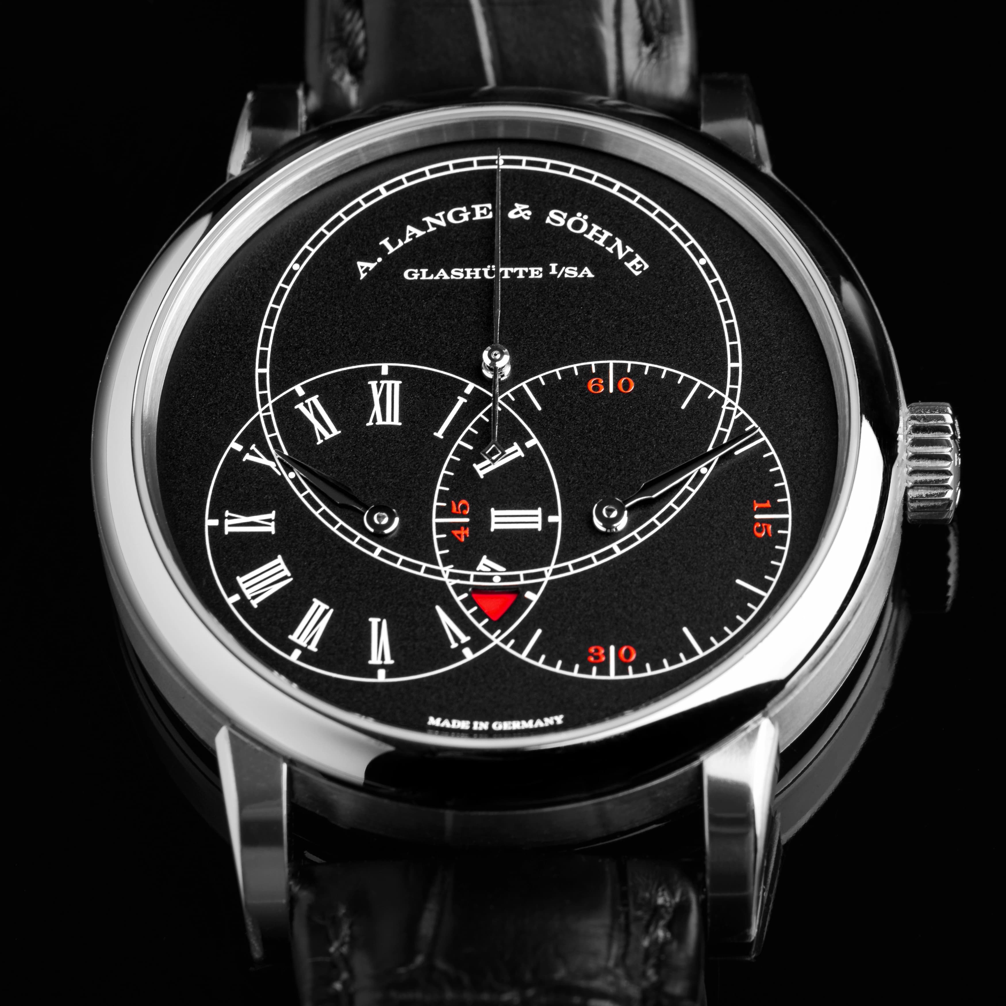
“Consistent use of a specific typeface is one of the best ways of building a brand identity within a watch,” explained Yuen-Rapati, and it’s exactly why Lange feels so immediately recognizable. Even to the untrained eye, there’s a rigidity and discipline to their typography that calls out to something deeper. “One of the reasons why watches from brands like A. Lange & Söhne…are immediately identifiable is because of each brand’s rigidly consistent use of their typography.”
When that typography is bespoke, its effect hits even harder. “Bespoke typography is another method to build identity as its tailor-made nature is inherently tied into the watch’s overall design,” noted Yuen-Rapati. In Lange’s case, that tailoring becomes part of the brand’s essence.
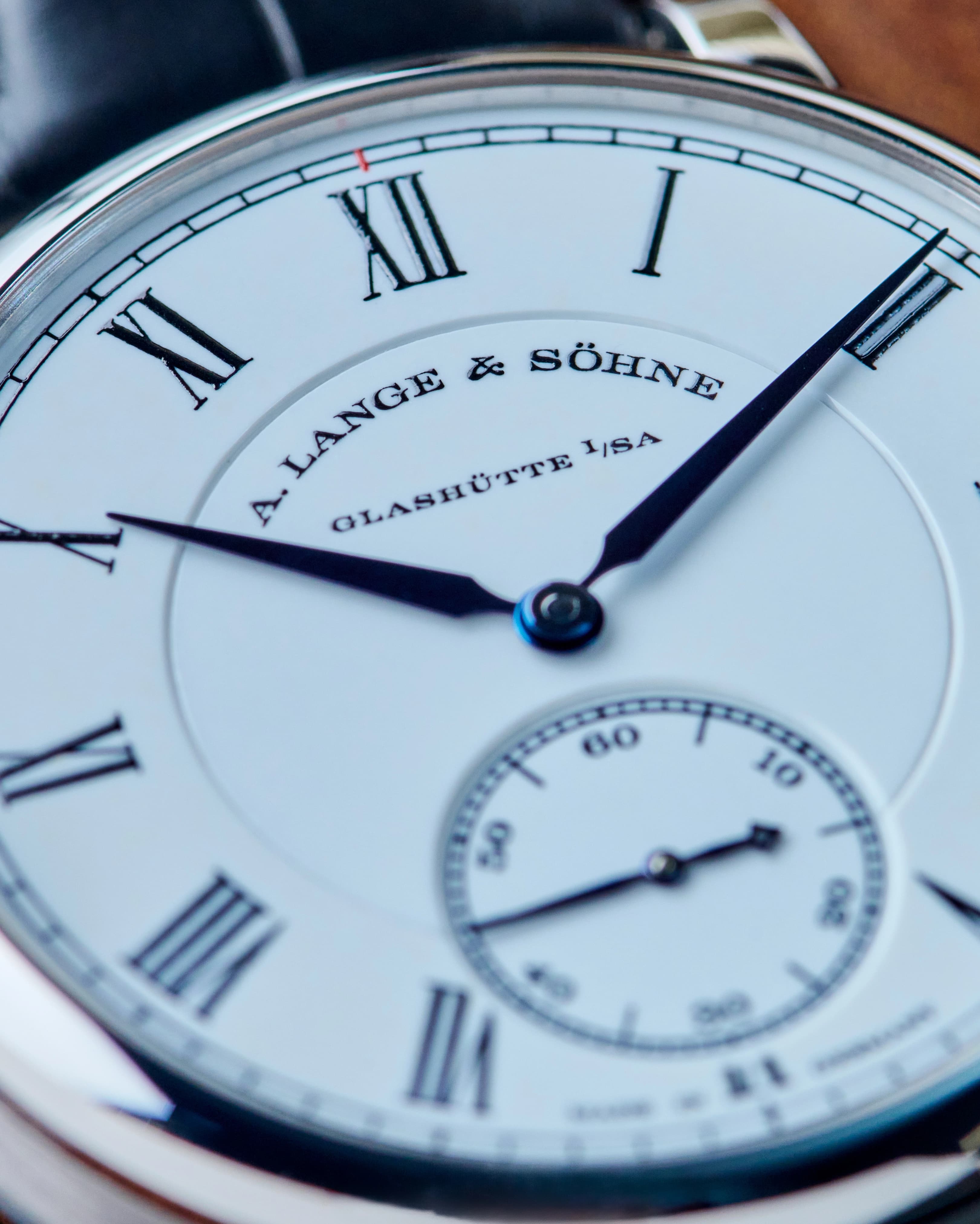
The arched “A. Lange & Söhne” signature is front and center on their dials and is paired with the text, “Glashütte I/SA” beneath it, re-establishing a new narrative through their place of origin. The serifed letters are severe and so… German in character, inasmuch as they seem historical without drifting into the ornate or nostalgic. The typeface communicates precision and discipline.
The modern Lange typeface, introduced with the brand’s revival, is inspired by late-19th-century engraving styles. And in 2012, Lange introduced a more modern interpretation that was finer and a bit more delicate. You may not even notice it unless you put the watches side by side, but you feel it over time.
If you think that these details and changes seem small, that’s totally understandable, but “history and heritage are important to German brands, and Lange drew inspiration from a serif typeface created in 1899 called ‘Engravers.’ They made lots of small adaptations, most notably the careful swoop at the top of the ampersand,” said Christopher Weiss, Watch Specialist at European Watch Company. The ampersand used by A. Lange & Söhne is now flattened at the top with a long, expressive curve. It’s so recognizable - a signature within their own signature. For a brand that is usually seen as serious, there’s something playful and creative about their interpretation of the ampersand.
And this idea of font and reinvention harkens back to the grander idea of expression. Reminding you where a brand has come from, what it’s been through, and perhaps where its values lie. In the case of Lange, it bridges a fractured history.
Final Thoughts
The more time you spend with watches, the more details you gather, slowly drifting from the obvious and discovering the intentional. Beyond the logo and innovative movement, to the small decisions that define a brand's design ethos. Cases born of purpose, gemstones that add levity to stiff architecture, or a typeface that’s morphed to suit a brand’s complicated history, these nuanced aesthetics work together to create something unforgettable.
These are the details that, over time, catapult brands, and individual references, to icon status.
Shop New Arrivals

Diver X The Ocean Race Carbonium Gray Dial 2024 LIMITED
$9,450
View Watch
PAM00287 Radiomir Black Seal Automatic SS Black Dial LIMITED
$3,750
View Watch
C1 Bel Canto Titanium Purple Dial 2025
$4,650
View Watch
AR8.810 Arceau Grand Lune SS Blue Dial 2025
$4,750
View Watch
Shop New Arrivals
Diver X The Ocean Race Carbonium Gray Dial 2024 LIMITED
$9,450
View WatchPAM00287 Radiomir Black Seal Automatic SS Black Dial LIMITED
$3,750
View WatchC1 Bel Canto Titanium Purple Dial 2025
$4,650
View WatchAR8.810 Arceau Grand Lune SS Blue Dial 2025
$4,750
View Watch
More Content