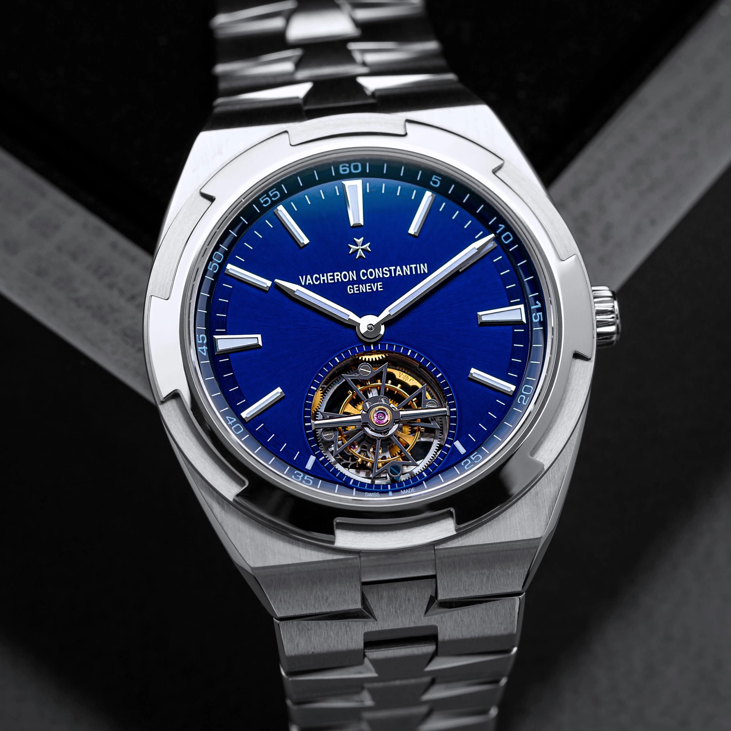
Time-Only Watches: The Case for Pure Simplicity
Published on 6/5/2026
Some watches grab your attention with bells and whistles, extra hands, a plethora of subdials, complications stacked like a résumé, and textures layered like your latest vision board. And yet there are watches that are far more disarming, and in a way, much more intriguing, because you’re pulled in through their simplicity.
Watch enthusiasts celebrate ingenuity and complexity, yet there’s something visually compelling in a properly executed three-hand, time-only watch. You can gawk at a tourbillon, try to decipher and set your perpetual calendar, and marvel at that one time every four years it hits that 29 at the end of February. But brilliantly-considered simplicity never gets old, and often, that apparent simplicity reveals itself as something far more deliberate.

Yet there’s still some confusion in regard to simplicity, as it’s often used interchangeably with “minimalism”. They’re not the same thing, though watch design loves to blur the line. Perhaps because minimalism sounds fancier, or because calling something “simple” may have a misplaced negative connotation. But there is a difference. Minimalism is a visual language; a set of aesthetic choices that strip things back to bare forms, open space, and restraint. It’s one way to arrive at simplicity, but it’s not the only way. True simplicity is not about how little there is, but rather about what’s left after everything unnecessary has been removed. While minimalism may be a style, simplicity is a process. You can have a richly textured dial, applied numerals, even a bit of flourish, and still achieve simplicity, as long as every element feels essential.

And therein lies the difficulty, because designing something simple isn’t a shortcut; it’s painstaking. Every decision needs to feel on purpose, as each one carries so much weight in the overall design. Proportions have to be exact. There’s an art to the length of a handset, the thickness of a bezel, and the exact tone of a dial. In complicated watches, visual balance has to be negotiated between many competing elements. In a time-only watch, it either works or it doesn’t.
Then there’s the paradox of simplicity: the simpler something appears, the more consideration it usually demands. It’s the same thing that happens when a writer tries to tell a story. It’s far more difficult to grip an audience with something straightforward than it is to drown them in details. A creator must understand what is absolutely essential and hold on to just that. This requires clarity of intent, a sensitivity to the audience, and a willingness to refine, closer to editing a great sentence than assembling a machine.
Time-only watches that achieve this considered simplicity carry an appeal in the enthusiast community because they represent both achievement in watchmaking and design at its highest standard: what endures isn’t always what does the most, but what gets the essentials just right.
Romain Gauthier MON00580 C: A Study in Geometry
Romain Gauthier, with the MON00580 C, achieves simplicity by removing the unnecessary and, instead, playing with geometry in all its beautiful, contradictory complications.
This is a watch that looks ordinary at first, yet the more you stare, the more it messes with you. The case is fundamentally round, but by no means is it basic. The sides of the bezel are scalloped, while the top surface goes into a crisp dodecagon. The facets and angles could be chaotic, but they make space for one another.

The dial continues this conversation. The minute track forms a circular anchor, but it doesn’t take up the proper amount of space. Instead, the dial extends beyond the minute track, both wider and expanding downward, creating room for the sub-seconds at seven o’clock to radiate outward. The placement might feel off-balance, but the crown at two o’clock pulls in the opposite direction, distributing the visual weight.
Every time this watch seems loud, there’s a counterforce that proves the visual consideration. The sandblasted gray titanium dial quiets light, allowing the white numerals, hands, and indices, along with the blue dial accents, to do their job with brilliance. The grade 5 titanium case, 41mm across and slim at 9.6mm, plays with alternating satin and polished surfaces, giving the case itself a sense of motion. The coordinating titanium bracelet makes the entire watch extremely lightweight, with the whole piece weighing in at just 85 grams.
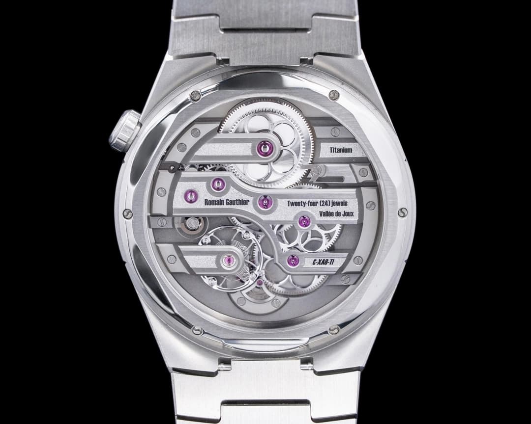
Flip it over, and the philosophy of geometry holds. The hand-wound calibre, just like the dial above, rewards attention with depth: rounded rectangular German silver bridges holding onto circular gears, and hand-engraved textures. A 60-hour power reserve and stop-seconds function ground it in practicality, but the real appeal is in how it’s made.
The MON00580 C finds simplicity without dialing things down, utilizing geometry to maintain intrigue in a three-hand watch.
Vertex M100A: Purpose-Built Perfection for the Field
Field watches have always been the purest expression of time-only design. Strip away anything that doesn’t serve legibility or function, and what you’re left with is the truest essence of a time-only watch. In this class of watches, none can contend with the Vertex M100A.
Black dial, Arabic numerals, small seconds, and you've got the ingredients for your copy/paste, Dirty Dozen field watch. You could mistake it for any number of modern reinterpretations chasing the aesthetic of WWII-issued watches. But spend even a few moments with the M100A, and realize that it’s more than a recreation, certainly more than an homage; it’s direct lineage, and it has vision.

Images: Vertex
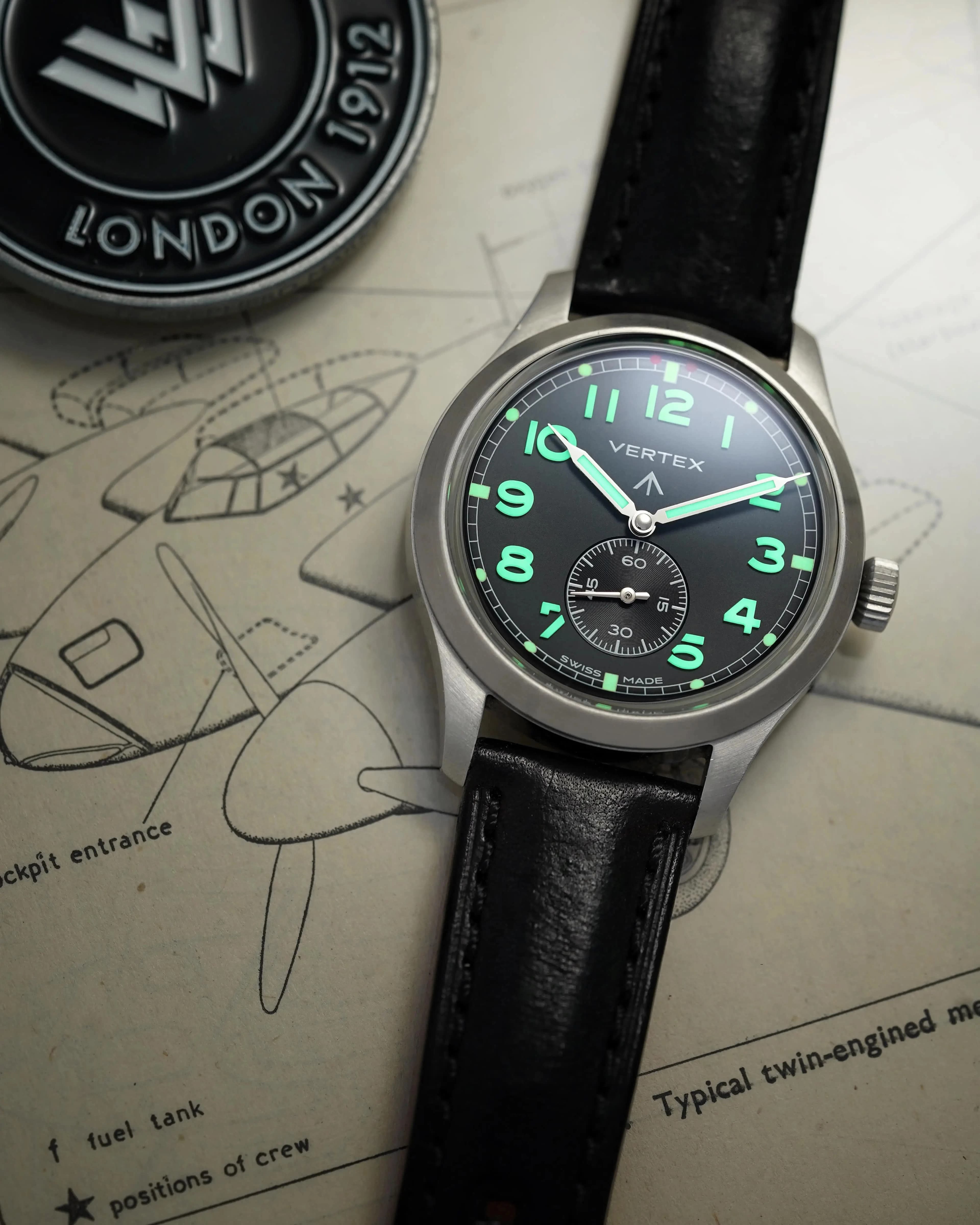
Vertex was one of the original “Dirty Dozen” manufacturers, one of twelve brands commissioned by the British Ministry of Defense during World War II to produce watches to strict military spec. Yet Vertex fell to the same old story that watch enthusiasts are used to; they shut their doors in 1972 during the quartz revolution. But Don Cochrane, the great-grandson of founder Claude Lyons, pushed the old doors wide open, like Aragorn charging into Helm’s Deep, reviving the brand with clear intent.
Cochrane describes that philosophy as “purity of purpose”, the idea that “when a device is genuinely designed to do a job, and nothing more,” it finds a kind of natural clarity. It’s a principle rooted in military design. “If a feature didn’t earn its place it could actively affect a mission,” Cochrane said. That idea reframes the entire Dirty Dozen aesthetic. What some might call simple is anything but. “Restraint and boring aren’t the same thing,” Cochrane notes. “Restraint is what happens when nothing is allowed on the dial for decoration alone.”
The M100A is tangible intent and the very definition of Cochrane’s mindset. It’s the kind of simplicity that comes from relentless refinement until reaching its purest form. The typography is crisp, and the large numerals add so much weight and drama to the dial. The numerals are made from deep, dimensional, sculptural blocks of X-1 grade molded Super-LumiNova. It adds so much presence, and is a watch that is radiant even in the daylight.
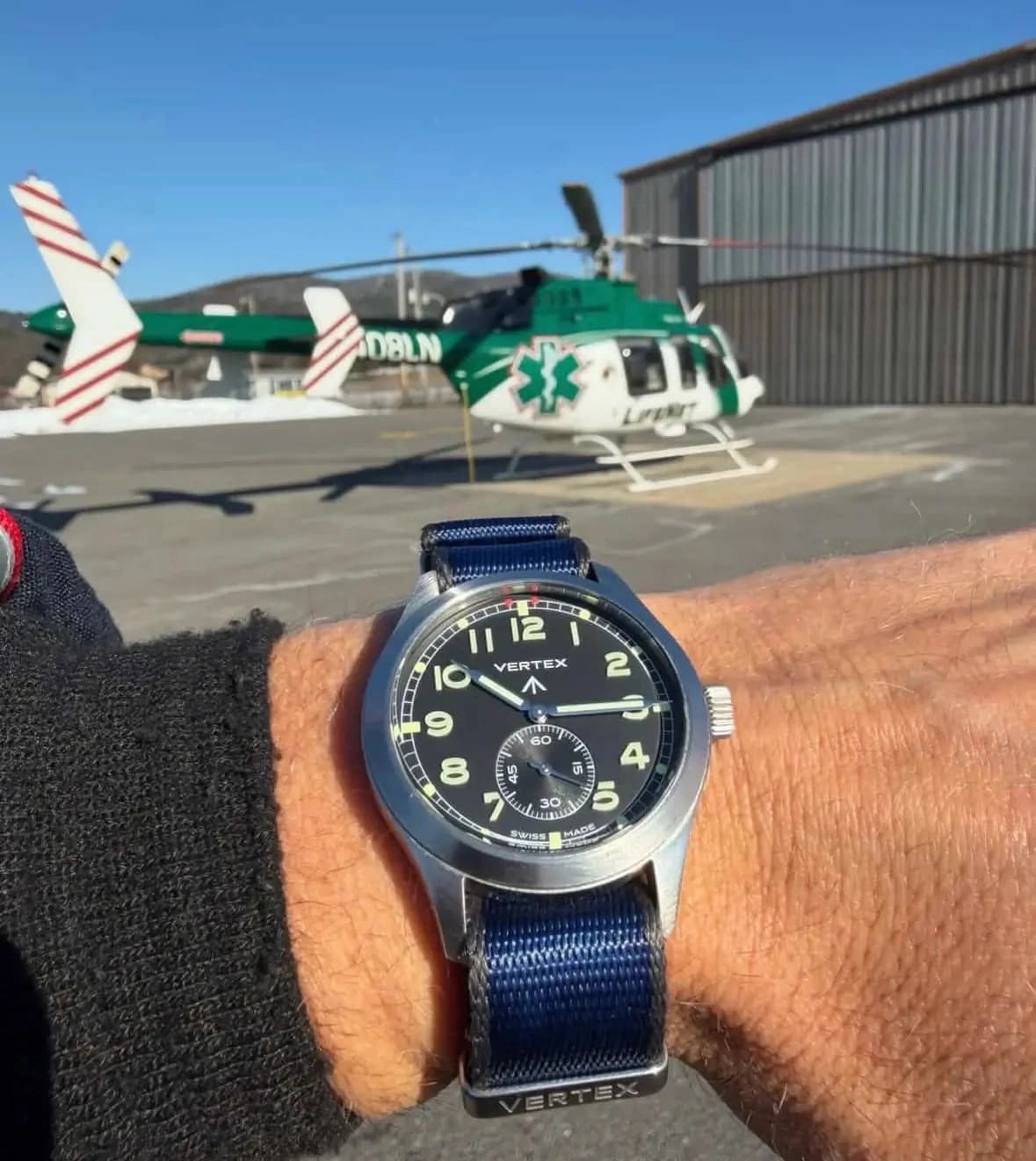
Image: Vertex
With a watch this simple, even the smallest details reveal purpose. The extended syringe of the minute hand lands precisely on the outer minute track, while the sub-seconds dial carries a subtle texture that brings balance through contrast, and yet nothing is fighting for your attention throughout the whole composition. It’s symmetrical on multiple levels, where every contradiction feels resolved.
The M100A is even more compelling when you consider how carefully it balances itself between past and present. Cochrane admits the temptation was there to simply recreate the original Calibre 59 piece outright. “The easy and emotionally safer route would have been a one-to-one remake,” he said. “But Vertex was always a working brand making working tools, not a memorial to one we made in 1944.” Instead, the goal was to carry that on into the future: “the dial architecture, the proportion logic, the legibility-first thinking, the refusal of decoration — and ask what each of those choices would look like if it were being made today, with everything we now know.”
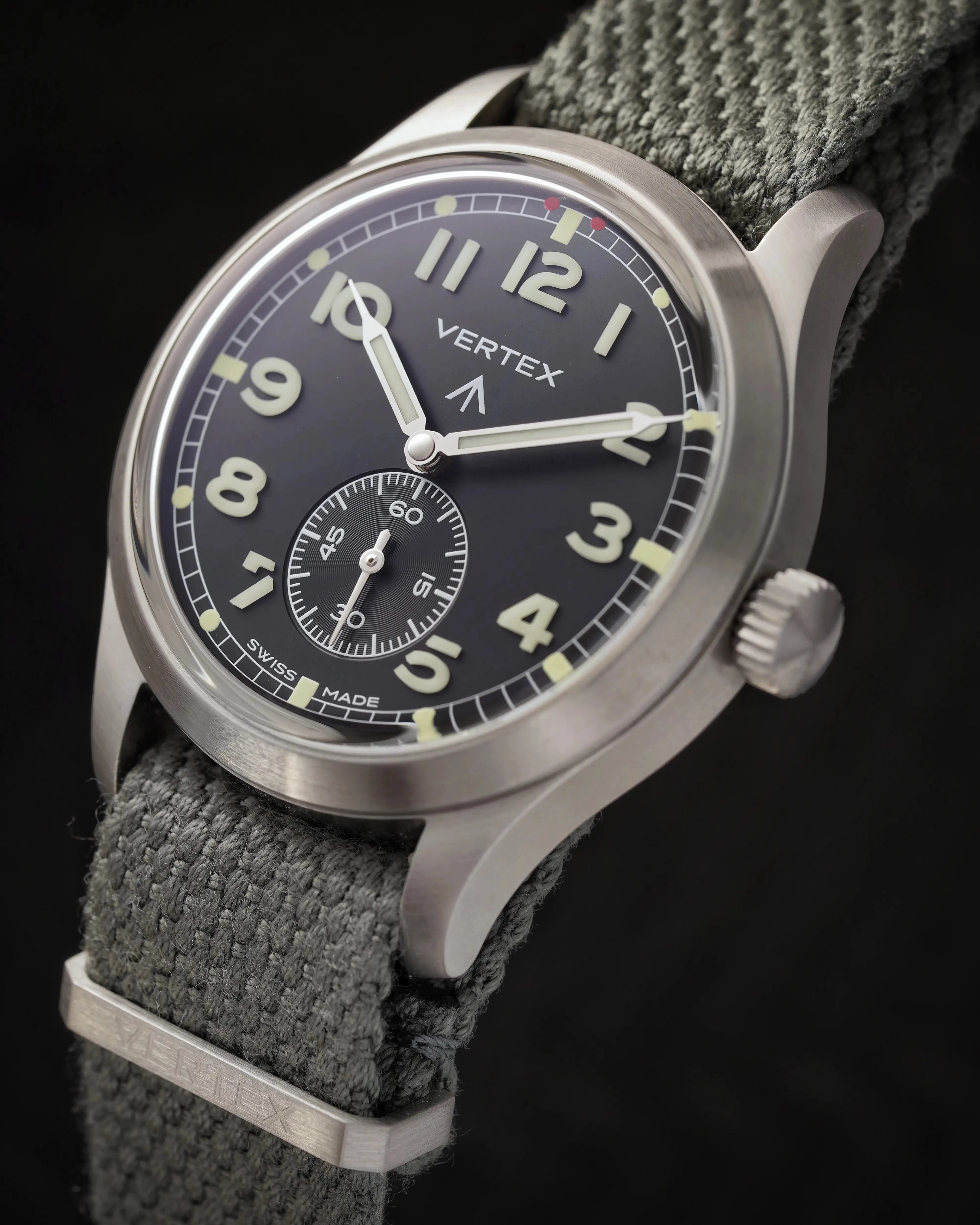
Image: Vertex
That means a 40mm case instead of 36mm. Super-LumiNova instead of radium. A sapphire crystal, not because it’s prettier, but because it increases legibility without scratching. Inside, a modern Sellita SW260-1 automatic movement that prioritizes accuracy, resilience, and usability.
“The hardest part, by a long way, was knowing what to leave alone,” Cochrane explains. “With a watch this iconic, every element on the dial has emotional weight — the railroad minute track, the broad arrow, the sub-seconds register, the typography, the matte depth of the black — and you arrive at each one with two voices in your ear. One says ‘this is sacred, don't touch it.’ The other says ‘this was a 1944 decision, we know more now, we can do better.’” The M100A is the result of navigating this tension over and over again until the watch is just right.
And that’s ultimately what makes it so effective. There’s a romance to it, but it’s looking forward, elevating the best qualities of the original. The Vertex M100A argues that true simplicity is about doing exactly what’s needed and having the discipline to stop.
Vacheron Constantin Historiques 1921 Excellence Platine: Simplicity Knocked Off its Axis
The Vacheron Constantin Historiques 1921 Excellence Platine is a watch that takes a more poetic route toward simplicity. This watch shares many of the same characteristics as those mentioned previously, yet deals a fluid hand.
The first thing anyone will do when they notice this watch is tilt their heads like a dog struggling to understand a new cue. The dial is rotated within a squared cushion case, with twelve o’clock turned toward what would traditionally be the two o'clock. The romantic explanation is that this was done for early motorists to read the time while keeping both hands on the steering wheel. Even though there is no reliable documentation to prove this origin, it doesn’t make the watch's design any less beautiful.
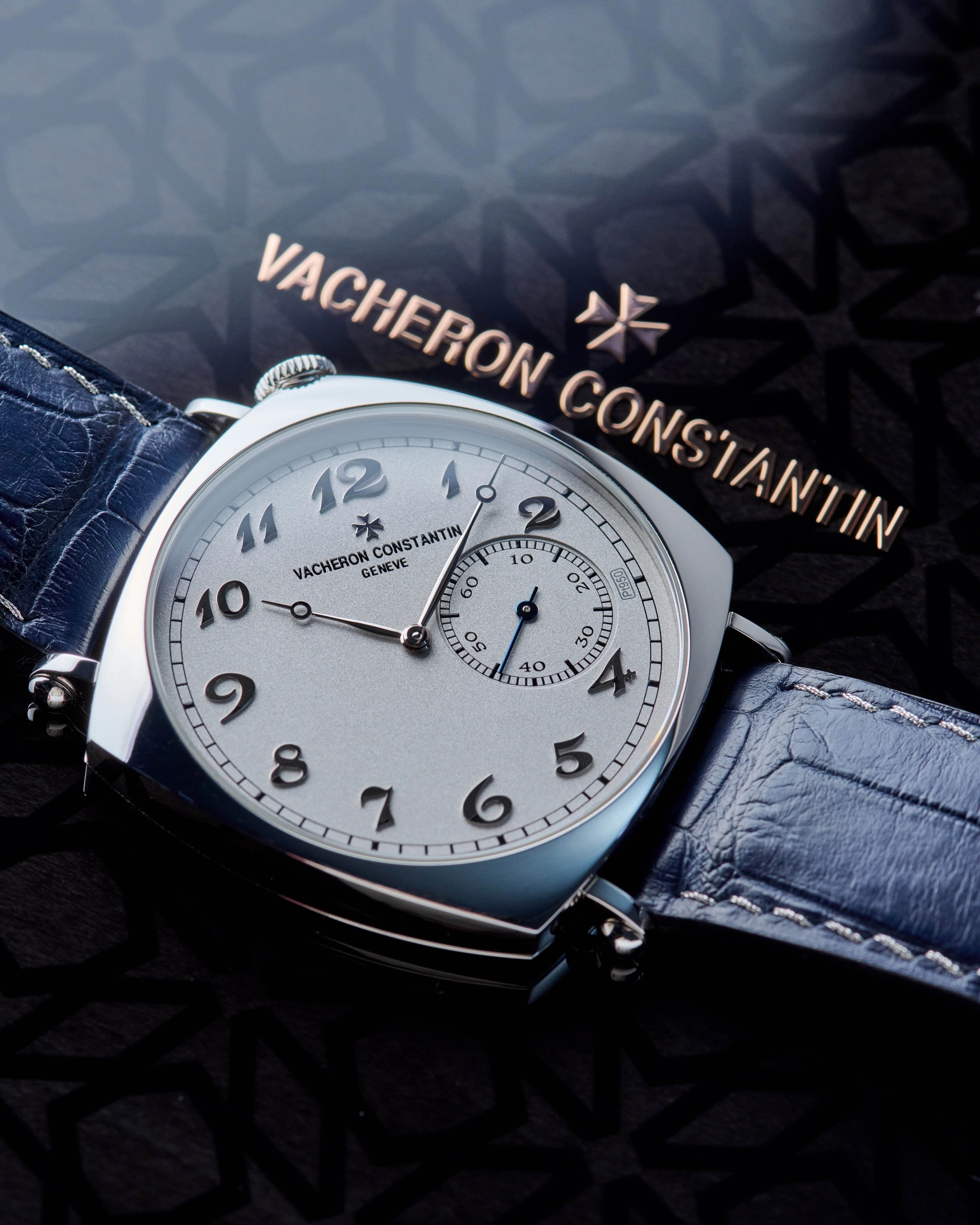
The watch, at first glance, feels formal and composed. The cushion case is polished, soft, and elegant, but in platinum, it exudes a bit of a sporty feel as well, especially compared to its gold counterparts. The dial, also in platinum, has a throttled glow, yet remains undeniably rich. The applied Arabic numerals and Breguet hands, each matched in tone, risk blending into one another, but somehow don’t. Legibility remains intact, assisted by finishing and proportion.
Now it’s time to deal with tilt. The sub-seconds at what is now the three o’clock reinforces the shift, and the crown, positioned in the upper corner above the twelve o’clock index, completes the off-kilter symmetry. It’s intuitive, and after spending a few minutes with it, feels oddly natural.
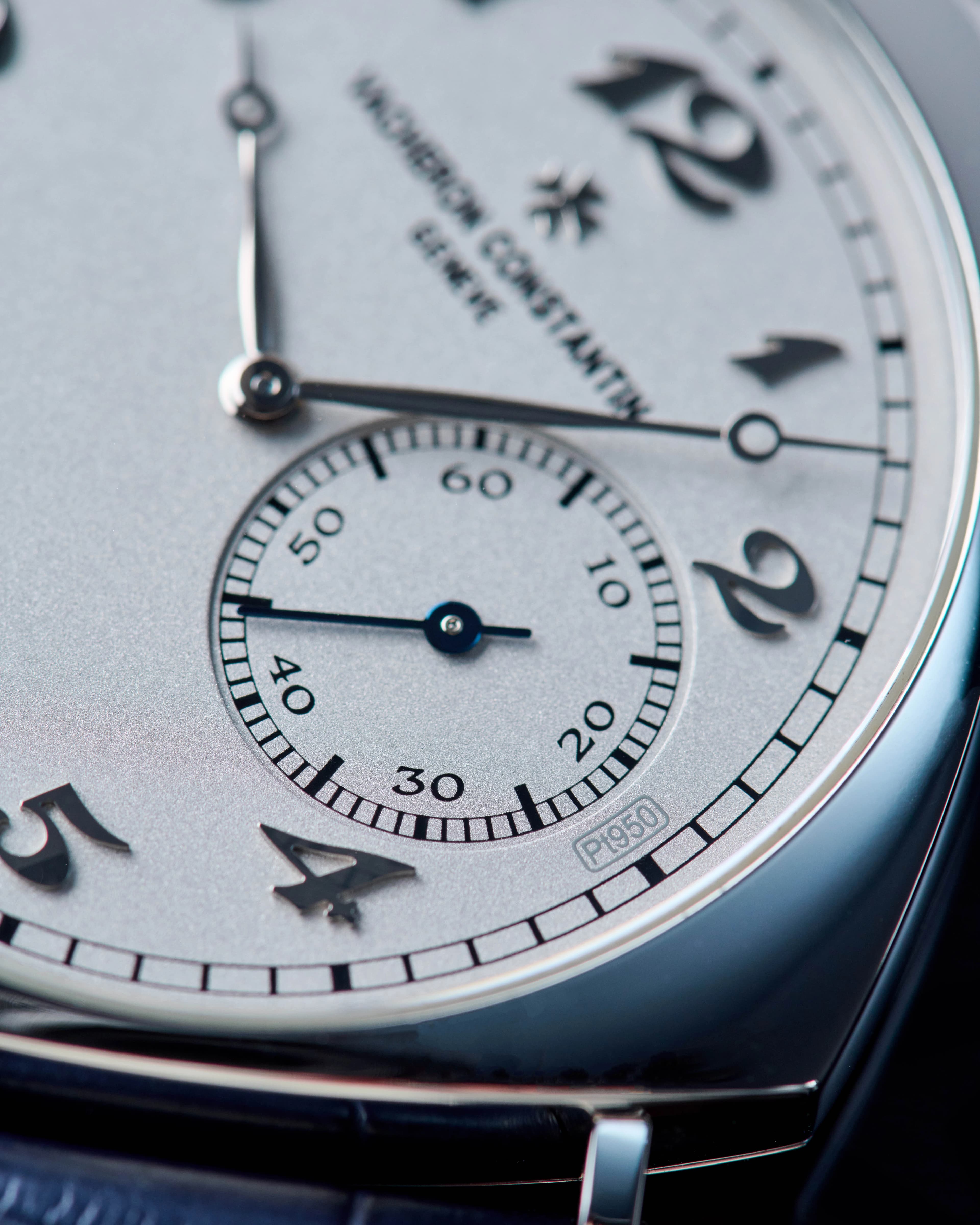
The simplicity isn’t derived from strict symmetry or obvious geometry, but from a more nuanced cohesion. Every unusual decision is measured and properly countered, and because of that, nothing feels out of place. The hand-wound caliber 4400 AS movement inside is slim and beautifully finished, keeping the case slender and elegant at just over 8mm thick, while offering the kind of refinement expected from a manufacturer still operating at the highest level of craft.
Parmigiani Fleurier Tonda PF Chronograph Mystérieux: The Illusion of Simplicity
The Parmigiani Fleurier Tonda PF Chronograph Mystérieux is, for the purposes of this article, cheating. A five-hand chronograph has no business in a conversation about time-only watches. And yet, here it is, as what might be the most convincingly “simple” watch in the entire group.
At rest, the Mystérieux is restrained, even boring. Stainless steel case, a platinum coin-edge bezel, and that signature Parmigiani dial with Grain d’Orge guilloché that holds light, rather than reflecting it. There’s no subdial clutter or overt indication that anything unusual is happening. Just a clean three-hand display, with minimal branding, no text, discrete hour indices, and a minute track pushed all the way up against the edge of the dial. The whole watch has been shushed.
And then you press the monopusher at seven o’clock, and the movement performs in the most dramatic way. The central seconds hand snaps to twelve and takes on the role of the chronograph seconds hand. The rhodium-plated hour and minute hands follow suit, popping to zero and transforming into the hour and minute counters for the chronograph. The illusion of what seemed to be an old man's watch is broken, revealing a second set of rose-gold hands beneath the rhodium-plated ones. These gold hands continue to track the actual time, while you’re properly fiddling around. Press again, and it was all just an illusion. The rhodium hands return to their normal positions, the gold hands vanish, and the watch is an unassuming three-hander once again.
.jpg%2F8ffa968ef631905549e6c6b73bd04f2c%2Fceo_visual_tonda_pf_chronographe_mysterieux__2-(1).webp&w=3840&q=75)
Image: Parmigiani Fleurier
While this may come off as a party trick, some serious watchmaking innovation is going on here. Parmigiani’s in-house PF053 calibre, a column wheel, automatic monopusher chronograph running at 4Hz, with a 60-hour power reserve and over 300 components working in harmony. The placement of the monopusher at seven o’clock isn’t a quirky design flourish; it follows the case architecture. And like everything Parmigiani has been doing lately, the finishing might be constrained, but it’s well-considered. There’s so much hand detail in the case, movement, and dial to hold a lifetime of admiration.
Parmigiani has dabbled in this type of sleight of hand before, with the Tonda PF GMT Rattrapante, which tucked away a GMT hand in a similar fashion, and the watch enthusiast community was delighted and mystified by it. But the Mystérieux pushes that idea further, continuing its streak of delightfully simple watches whose identities change completely with the compression of a pusher.
What makes this far different from the other watches on this list, aside from it absolutely not belonging in this list, is that this watch achieves simplicity through the wearer’s own control, instead of just the designer’s restraint. The watch is complex only when you want it to be.
When the Watch Dial is the Whole Story
For a topic on simplicity, this got complicated quickly.
But that’s the trick to time-only watches, there’s nowhere to hide, and every decision adds up. There are no subdials to distract, and usually no complications to impress. And so what you have left is design at its purest: proportion, balance, and restraint. Anyone can add more, and only the best know when to stop or take away.
Whether it’s geometry doing the heavy lifting, purpose driving every decision, a dial that’s slightly off-kilter, or an entire chronograph pretending it doesn’t friggin’ exist, each of these watches makes the same argument: that simplicity means getting everything just right in the most economical way possible.
Shop New Arrivals

116710LN GMT-Master II Ceramic SS Black Dial
$13,900
View Watch
PFC231 Tonda Hemispheres Dual Time 18K Rose Gold Cream Dial
$20,900
View Watch
230.2.45 Reverso Squadra Chronograph GMT 18K Rose Gold Black Dial
$16,500
View Watch
326934 Sky-Dweller SS Silver Dial
$18,900
View Watch
Shop New Arrivals
116710LN GMT-Master II Ceramic SS Black Dial
$13,900
View WatchPFC231 Tonda Hemispheres Dual Time 18K Rose Gold Cream Dial
$20,900
View Watch230.2.45 Reverso Squadra Chronograph GMT 18K Rose Gold Black Dial
$16,500
View Watch326934 Sky-Dweller SS Silver Dial
$18,900
View Watch
More Content